An added feature to Mint Mobile, allowing consumers to have a monthly unlimited data plan with multi-line discounts.
Introduction
People usually do not switch cell phone providers that often. Their cell phone provider of choice is usually a postpaid plan at one of the big three U.S. carriers: Verizon, AT&T, and T-Mobile. This is often because of advertisements, availability of retail locations, ability to finance phones directly with carriers, deals on latest flagships, and a perceived higher value.
Multi-line discounts are also another big reason people stay with their cell phone provider. Many adults stay on their parents family plan well into adulthood. Because it is cheaper to have all the lines on one account versus each spending more to have their own account.
Mint Mobile has carved out a niche in the prepaid market. They do buy in bulk plans. You purchase a 3-month intro plan then can transition to a 12-month plan to lock in same pay rate. Postpaid cellphone users who have expensive monthly bills don’t seem to mind buying in bulk since it costs about 2-3 times what their monthly postpaid bill is. And they get their phone bill paid for one year.
There is an area Mint Mobile hasn’t done: monthly plans and group/multi-line discounts.
Their prepaid competition, such as Cricket Wireless and Metro by T-Mobile, offer enticing multi-line unlimited data plans with perks included. What if Mint Mobile had a multi-line plan of their own? This is what this feature add-on project is about.
Project Overview
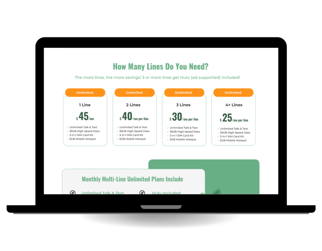
Goal: Create a monthly unlimited data plan with multi-line discounts and perks that integrates into Mint Mobile’s existing branding and interface.
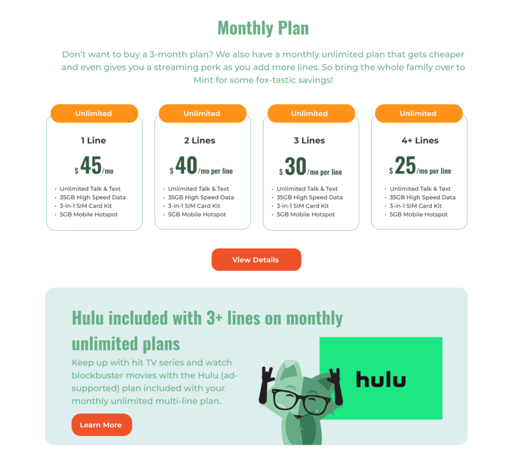
A competitively priced monthly unlimited data multi-line plan that competes with other prepaid carrier offers and provides customers with good value.
UX Research
Trends
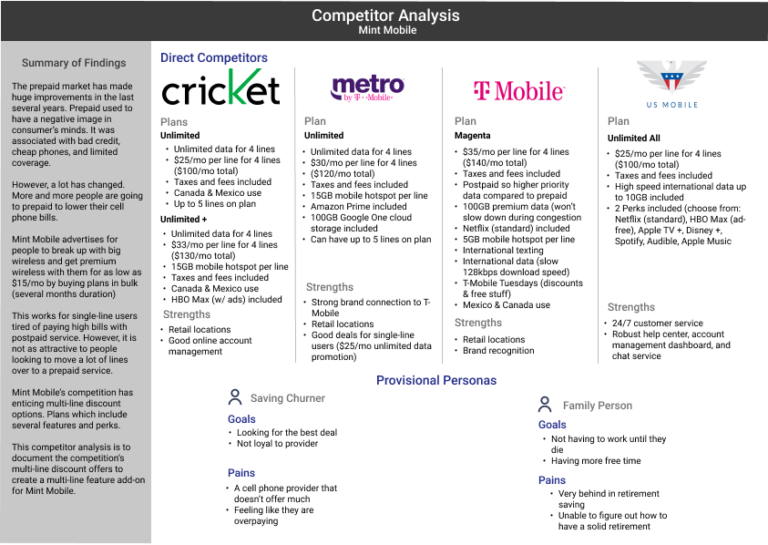
Many other prepaid budget carriers offer multi-line discounts. The main competitors of Mint Mobile are Cricket Wireless, Metro by T-Mobile, and US Mobile.
T-Mobile (postpaid) could also be considered a competitor since they have there Magenta plan which is $140/month (taxes and fees included) for 4 lines. Unlimited data and Netflix perk included.
All four of these brands offer multi-line discounts that also include perks. The perks include access to video streaming services such as Prime Video, HBO MAX (w/ ads), Netflix (standard), or Apple TV +.
Multi-line discounts are another way to help keep customers with the service longer.
A competitor analysis was completed to document the features, pricing, and notable aspects of Mint Mobile’s competitor offerings.
My Impressions
I don’t know if Mint Mobile would even consider having a multi-line discount structure. Their website, advertisements, and brand messaging is centered around the “buy in bulk” idea. Churn is a big thing in the prepaid carrier industry. Without credit checks or expensive device payment plans, people change carriers in the search for a better deal.
What ways can Mint Mobile retain customers? Aside from the buy in in bulk strategy.
Hearing from the Users
Once the initial research was completed, I conducted two user interviews to hear directly from people who use prepaid cell phone services. One user was a current Mint Mobile subscriber and the other person had switched from Mint Mobile to Cricket Wireless.
The current Mint Mobile user was married with no children. He used Mint Mobile for him and his wife. He liked Mint because he it was cheap and he didn’t need any extras such as smartphone discounts, retail locations, or international roaming. He had had bad experiences at retail locations before with salespeople trying to constantly upsell him things. He didn’t mind paying for 12 months of service up front because his and his wife’s renewal’s were around tax time so he used his tax refund to pay both bills. However, he did say other cell phone plan deals were enticing.
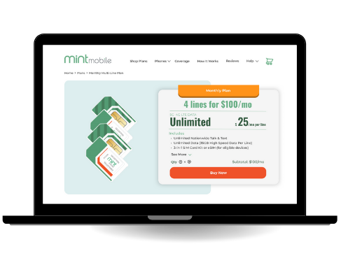
The second user interview was a former Mint Mobile subscriber. He was married with one child. He switched from Mint Mobile to Cricket Wireless for a few reasons. The main reason he switched from Mint Mobile to Cricket Wireless was because Cricket had a better deal for multiple lines. He liked how Cricket had a monthly unlimited data plan for 4 lines for $100/month (taxes and fees included).
Discovering Patterns
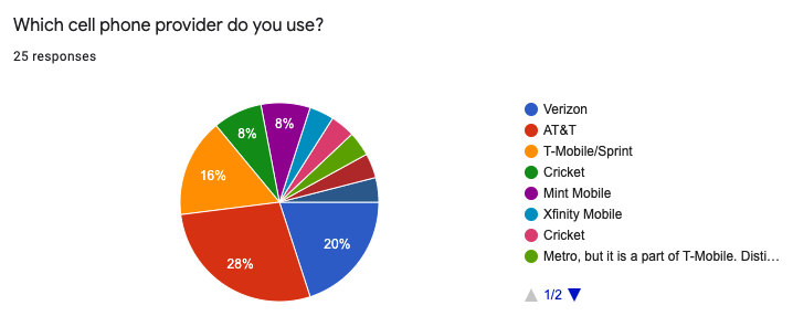
I wanted to discover any possible patterns in the how people managed, decided on, and used their cell phone plans. So, a survey for sent out. 25 people completed it. The questions mirrored what I asked in the user interviews.
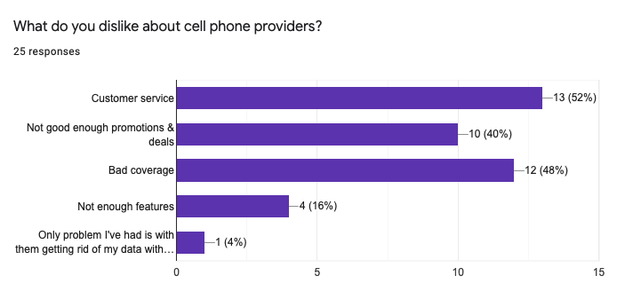
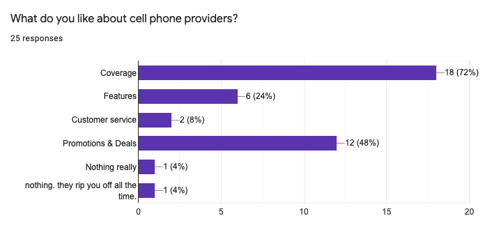
Many users reported customer service and bad coverage as things they disliked about their cell phone provider. 48% of users reported getting deals and promotions as something they like about cell phone providers.
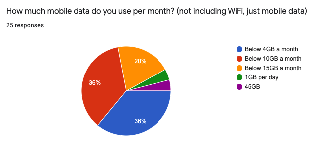
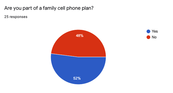
Nearly half of users reported being on a multi-line plan. Many of them also reported to using less than 10GB of mobile data per month.
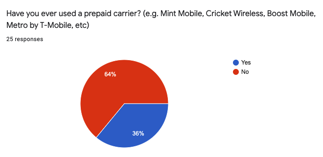
64% of users reported to not using a prepaid carrier. 48% reported uses Verizon or AT&T. There is still ample opportunity for user acquisition.
Many people are on multi-line plans. They value good coverage and good deals.
Takeaways
The main things that would make users switch cell phone providers
Good plan pricing
Good coverage
Good features
Good phone promotions
Common frustrations
Bad coverage and service availability
Customer service issues
Not good enough promotions and deals
Bad coverage
Something notable reported was 64% of users being on postpaid cell phone plans. 48% of users reported using Verizon or AT&T. I wondered if people still had outdated perceptions of prepaid services. The common stereotypes being how prepaid cell phone services are for low-income, bad credit people and only have cheap phones.
Many of the surveyors stated they had no apprehensions about using prepaid cell phone services. Some of them had been with their current provider for as long as 5, 10, even 20 years and had no desire to switch services.
A lot of the respondents were on unlimited data plan but mostly used under 10GB of data every month. People like the peace of mind being on an unlimited data plan provides. A business can deliver that without having to worry too much about overloading the network with heavy data users.
Definition
Creating the Typical User
Patterns became apparent after the user research was completed. The user interviews both had similar wants, needs, and pain points. The survey responses echoed many of the same things. People don’t often thing about changing their cell phone provider unless they have a bad experience, are enticed by a good deal, and/or are looking to save money.
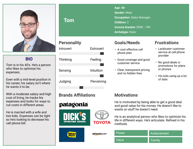
A user persona was created to better represent these patterns, pain points, and desires. Creating the user persona helped a lot when it came to drafting the copywriting for the product page. I had a summarized document to reference when figuring out which features to highlight and what needed to be prioritized on the product page.
Tom thinks logically. He runs all possible scenarios and advantages before considering something. He makes a good living but likes to make sure he is getting value for his money. He oversees all the bill management in his household.
He is looking for a cell phone plan with unlimited data since he doesn’t want to have to worry about his kids blowing through limits and racking up overage charges. A cell phone plan which doesn’t have hidden fees and bogus additional fees.
What Features Does Mint Mobile Need?
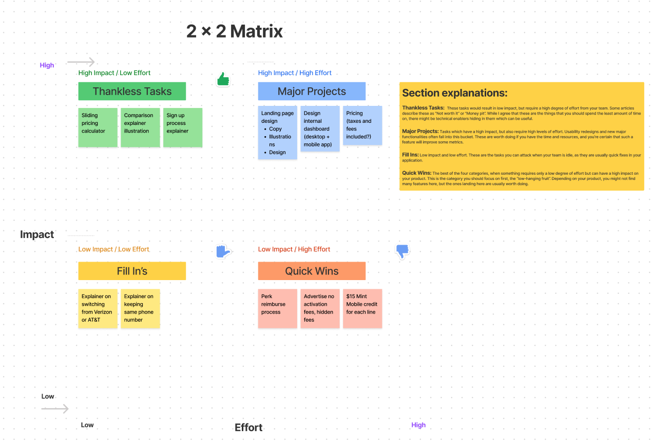
Having a set of patterns uncovered during research and a user persona made to encapsulate user needs and pain points, I now arrived at figuring out what features needed to be present. What did people need to really sell them on signing up for Mint Mobile’s monthly unlimited data plan with multi-line discounts?
A feature matrix was done inside Figma’s FigJam to prioritize what features needed to be present, the level of work it would take to complete each of them, and the expected outcome.
Product page for the monthly unlimited data plan with multi-line discounts needed to emphasis no hidden fees, value of plan, and explanation on how to switch from Verizon or AT&T.
User research process was done. Interviews and survey responses recorded. A user persona was constructed based on patterns observed. A roadmap of features was laid out. Now, I was left wondering what to do next. Dive right into designing? I wanted to spend a bit more time focusing on how I might address usrs through various deliverables. So I wrote down some how-might-we questions.
How might we design a website landing page that is easy to understand for someone who isn’t familiar with switching cell phone providers?
How might we address the apprehensions a user has toward prepaid service so they feel confident in choosing Mint Mobile?
How might we design a multi-line unlimited data plan that is enticing for a user and makes them consider switching from big wireless (Verizon & AT&T)?
How might we help a user have a smooth transition between services so they don’t have to deal with any service interruptions?
How might we make the order process easier so a user feels better about switching to Mint Mobile?
How might we make the internal dashboard better so a user has an easier time managing their plan?
Design
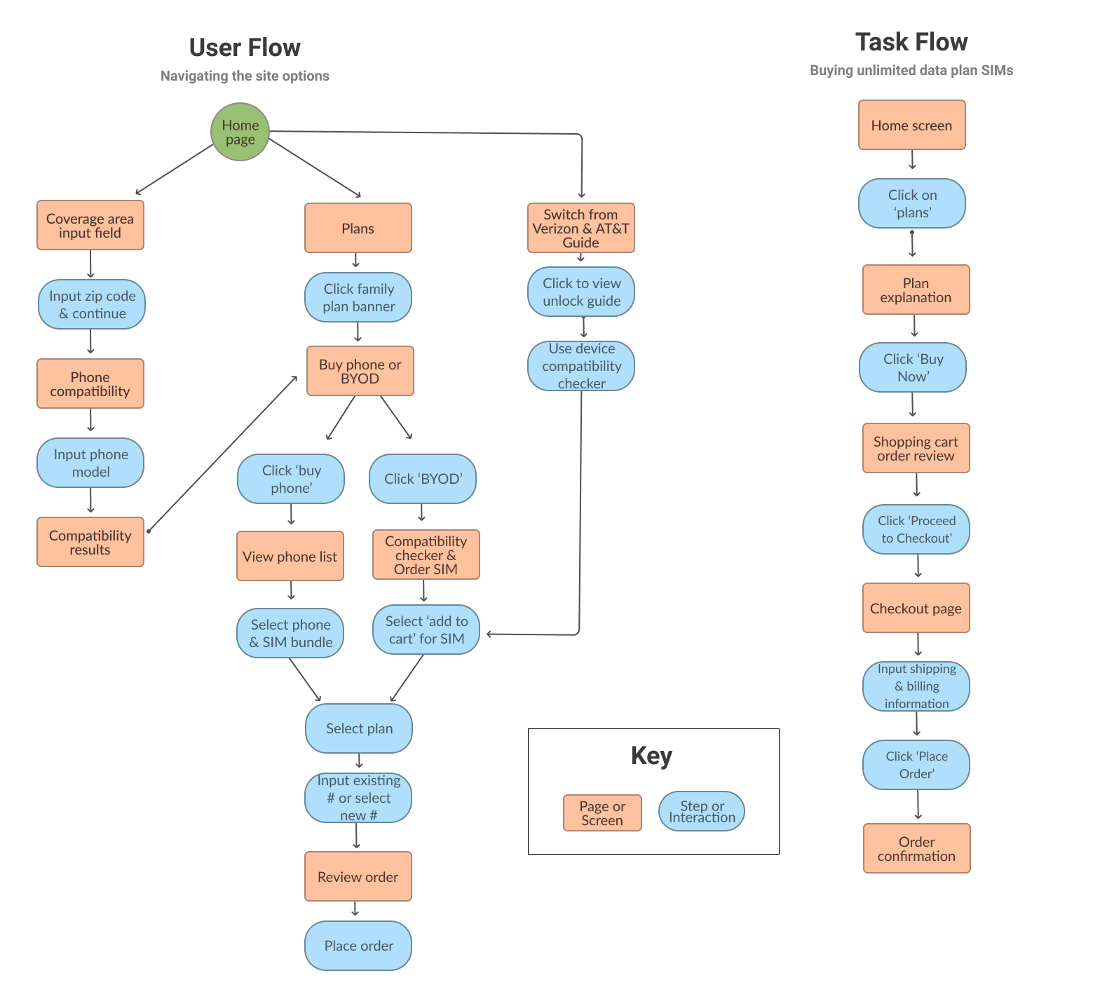
Understanding the User Journey
The feature add-on’s information architecture started to be mapped out. From the insight gained in the user research phase, I knew people didn’t switch their phone service very often. For many people, it’s confusing to switch phone services. They don’t know if they can keep their phone or their existing phone number.
The user persona’s desire for cost effectiveness and value was kept in mind. The feature matrix helped in figuring out which features needed to be present at certain steps.
Creating an effective user flow was essential. A good user flow would allow for me to figure out how a user might browse through the website. Opportunities for improvement to increase user acquisition could be discovered.
Putting the Screens Together
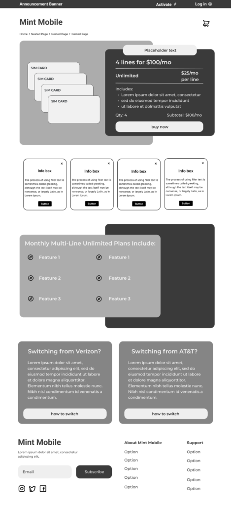
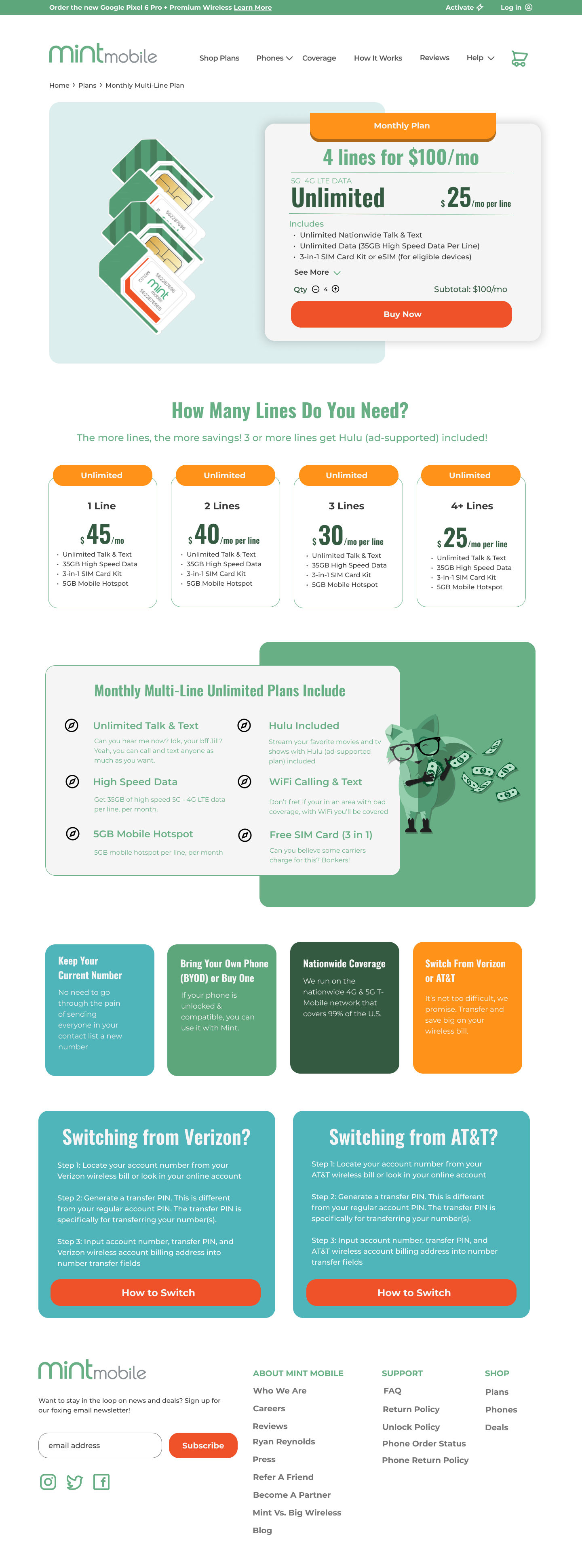
A foundation was now in place for the information architecture. The user flow and task flow were completed. Next, the visual design process started. I completed a basic low-fidelity hand-drawn sketch to decide what visual elements I wanted to include and where. From there, a mid-fidelity wireframe was done for the monthly unlimited data plan page.
Bringing Things Together
The mid-fidelity wireframes got some initial feedback from some design peers. It was mostly positive feedback highlighting how the layout was good and appreciating the important information (plan pricing and features) being near the top of the page. Going to the high-fidelity wireframes, I kept the user flow and task flow in mind as I finished the pages.
Matching Mint Mobile’s existing branding and UI was critical since this was a feature add-on that could potentially be on Mint’s real website.
Design considerations included:
fitting the user flow into Mint’s existing site branding for seamless flow
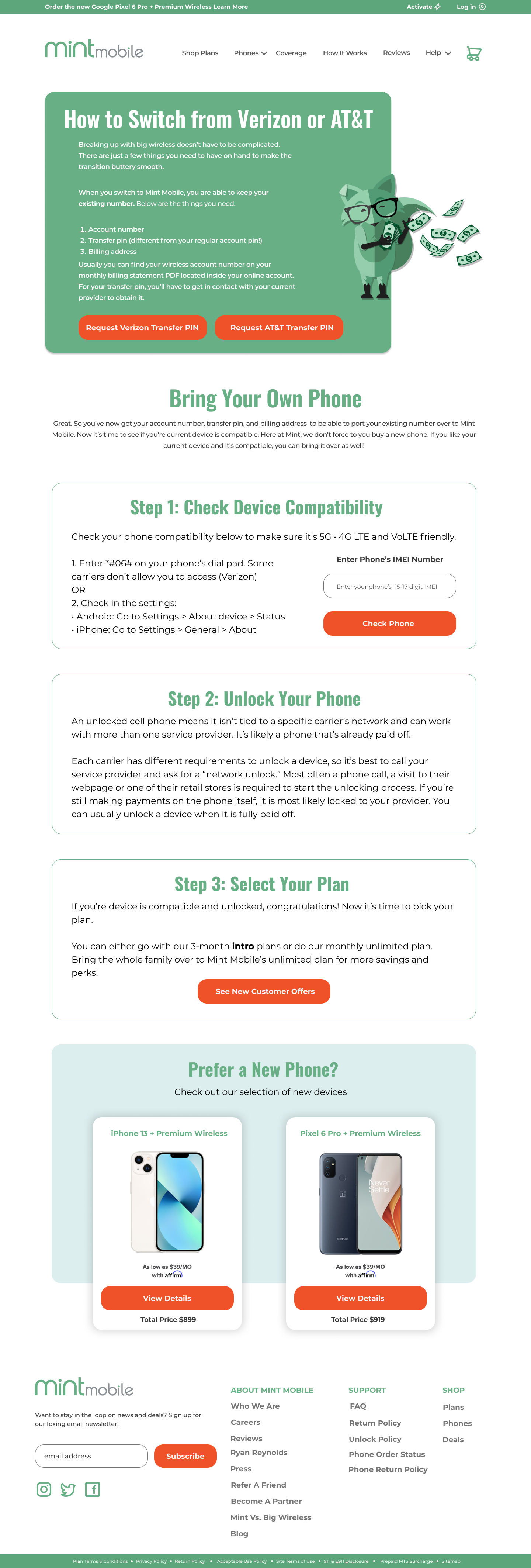
Including a full page how-to-switch guide for Verizon and AT&T users since confusion over switching was expressed in user research.
Emphasizing the value proposition for choosing the monthly unlimited data plan
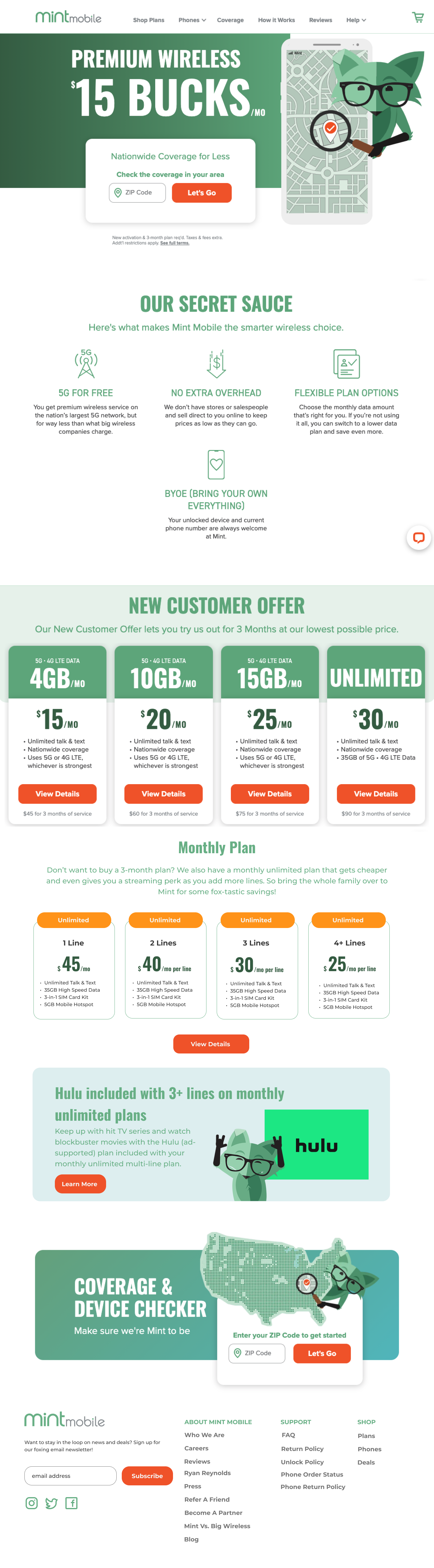
Everything was brought together to make the prototype which can be viewed by clicking button below. The main purpose of the prototype was to see the level of ease users had in finding plan and adding to cart, discovering information about new plan, and what was needed to switch from Verizon or AT&T to Mint Mobile.
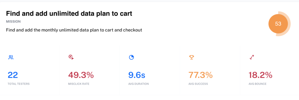
Now, it was finally time to get the users thoughts on the prototype. I started the usability testing. Two test were conducted two in-person. The rest were done remotely by sending out a link to participants. 25 people completed the remote usability testing. For the remote usability testing, participants had to complete a few different missions:
Find and add unlimited data plan to cart
Give me answer on some features of unlimited plan?
Tell me what 3 things are needed to port existing number from Verizon or AT&T to Mint Mobile
Check device compatibility
Above is the main mission I had users complete: find and add an unlimited data plan to cart. There was a high mis-click rate of 49.3%. When I looked at the heat maps, I noticed people were clicking the ‘plans’ page button in the top menu bar. I had only put the click path further down on the home page where the plan explanations were.
I corrected this by putting a clickable section over the ‘plan’ menu option in top navigation bar. So, when people click it, it takes them straight to unlimited data plan page to complete mission.
Usability testing revealed the need for putting multiple path options on page so user doesn’t get confused
Despite the high mis-click rate on the first mission, users were able to successfully answer the two open ended questions asked as part of the usability testing:
Give me answer on some features of unlimited plan?
Tell me what 3 things are needed to port existing number from Verizon or AT&T to Mint Mobile
There didn’t need to be any major design iterations needed. Just adding more clickable paths onto the prototype, which I did.
Conclusion
Key Takeaways
It was very interesting getting to do this design project. I have a fair amount of knowledge of the cell phone industry and plans, having working in a customer service role for a big U.S. cell phone provider. I’ve personally used different prepaid cell phone services over the years.
Prepaid has always had this lagging stereotype about being only for low-income people and those with bad credit. People think you can only use cheap, crappy phones with prepaid. They don’t realize you can use the latest flagship phones such as the iPhone 13 or Samsung S21 on prepaid and save a bunch of money versus using postpaid.
I admire Mint Mobile because they have been shaking up the prepaid industry. They popularized the “buy in bulk” approach to cell phone plans.
The user research phase showed me people don’t put a lot of thought into their cell phone service. They usually just use what their parents have, or what their family has told them about. And it usually takes a bad experience with current carrier or a really good deal in order for them to switch.
What’s still left to do
I would like to design a graphic or web page talking about the amount of savings a person could get from switching. Mint Mobile currently has a savings calculator on its website. However, I would want to visualize it better. When people can see how much they will save, and what they can do with those savings, they are more likely to switch.
Run a beta release of the monthly unlimited data plans to determine interest
Offer switch promotions if a person switches from Cricket Wireless, Metro by T-Mobile, or US Mobile.
Redesign the Mint Mobile internal dashboard. I really want to do this!