Case Study
Repository
Investing feels complicated
Investing feels complicated for many people. They see thousands of different stocks and bonds available. They don’t know which one to pick. They don’t even know how to pick them. What account do you use? What’s a 401k? They see the news stories about the stock market crashing. They remember the 2008 crash. Investing feels risky and not worth it.
Many people opt not to invest due to fear, lack of knowledge, and lack of quality, unbiased resources.
That’s bad. Investing in the stock market is the main way many people can build long-term wealth and reach financial independence. Let’s go through some examples of how waiting to invest can be massively detrimental to a person.
Meet three people
Each of the three people decide to invest $500/month in a Roth IRA, a popular tax-advantaged account that holds investments. The only difference is the ages they decide to start investing.
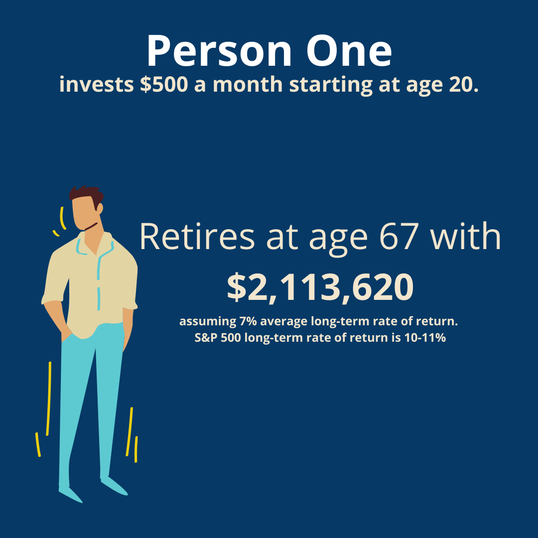
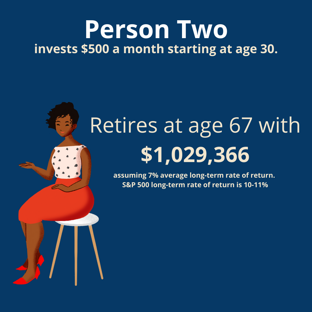
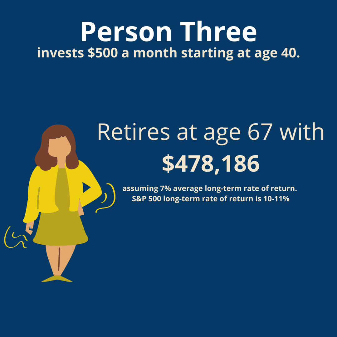
Despite investing the same monthly amount and getting the same rate of return, the person who decided to start investing at age 20 ended up with $1,635,434 more than the person who started at age 40.
As you can see, time in the market is an important thing. Holding off on investing can cost people hundreds of thousands (or even millions!) of dollars.
Making investing seem complicated is intentional

User research
Figuring out the Scope
Armed with some background knowledge on the investing and financial industry, I tried to figure out what deliverables I would need to complete for user research.
To start the user research, I went through several popular Reddit financial forums and Facebook groups.
Forums and groups where people would ask personal finance questions and talk about their habits.
An Idea of an Investing Education App
Repository is an app for teaching you about investing in the stock market via low-fee index funds to help you build long-term wealth. There are also addional recommendations for budgeting, saving, credit cards, and other personal finance topics.
A project brief with objectives, future outlook, and revenue plans can be found here.
Solution
An end-to-end iOS app for helping users learn to invest in the stock market with index funds.
Team
Mostly solo project, developer
Role
UX Research / UX Design / Brand Design / Copywriting
Repository
In my secondary research, I saw how there was a massive need for a comprehensive financial literacy resource. Many people struggle with saving money, figuring out how to prioritize their money goals, pay off debt, increase their income, and investing.
Building something to address all these needs would be a large task, so I figured it would be better to start small. A focus on one of the personal finance topics people struggle with: investing.
There is the saying “You don’t know what you don’t know”. When it comes to investing, people often don’t even know what the first step is to learning and doing it.
There are three main brokerages often used to invest: Vanguard, Fidelity, and Charles Schwab. All of them haven’t done the best at making educational material for new investors. Some of their funds require high minimums to such as $3,000 to even start investing in the fund.
This has led to an opening in the financial technology “fintech” market: the rise of robo-advisors.
Rise of robo-advisors
Millennials and Gen Z love robo-advisors because of their nice user interfaces, ease of use, and lower or no minimum assets required.

Financial Influencers
Financial influencers have become popular on TikTok, Instagram, and YouTube for being accessible and relatable.

Passive investing is the way
Some financial advisors claim their expert advice is criticial, but a study done by Fidelity showed passive investing produced the best returns.
The rise in popularity of robo-advisors and the reasons people give for using them show the difference a good UI design and brand identity can do. People like the modern and simple user interfaces robo-advisors have. Many of the long running brokerages have lacked this for a long time.
Competitor analysis
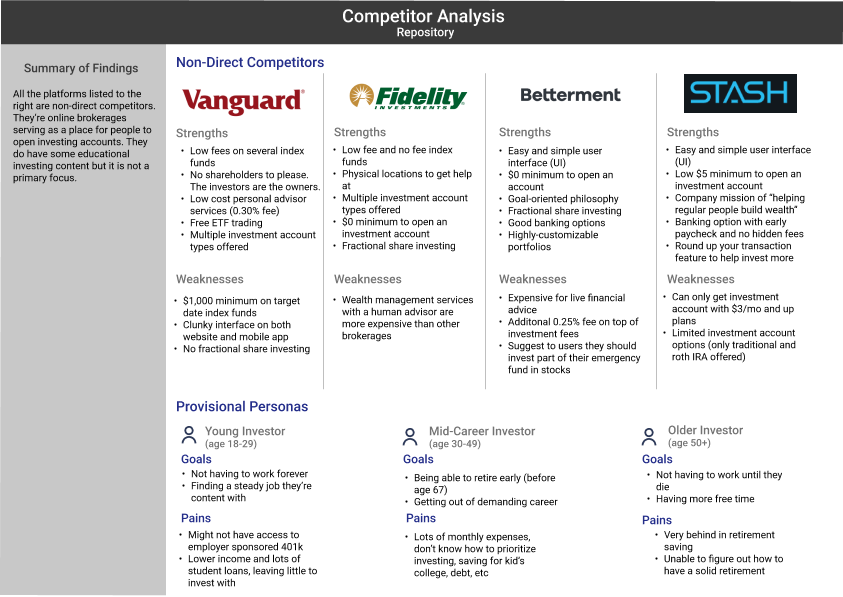
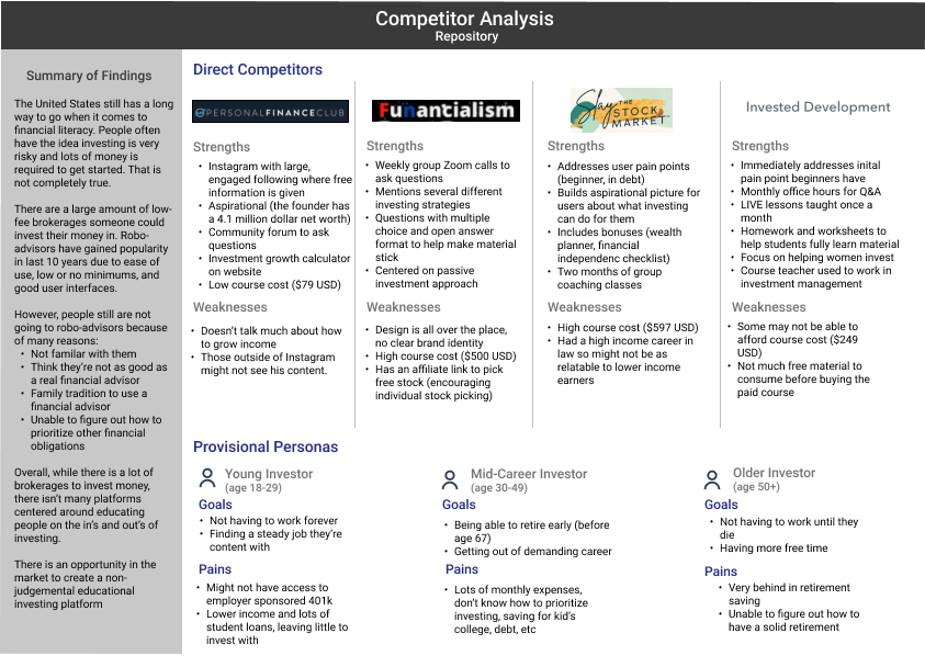
I conducted a competitor analysis to figure out what investing education material was currently available. There ended up being two sets of the competitor analysis:
- online brokerages offering educational material
- Online courses by individuals
Doing two sets of competitor analysis was important because I wanted to document traditional online brokerages and the rise of financial influencers as figures of authority in the online personal finance space.
This competitor analysis compares the strenghts and weaknesses of traditional brokerages (Vanguard, Fidelity) as well as newer robo-advising services (Betterment, Stash).
This competitor analysis compares the offerings of financial influencers investment education courses.
Interviewing users
Understanding the user’s perspective
It’s important to understand personal finance is just that: personal. After understanding what was currently available for people to learn investing, I set out to conduct some user interviews with real people. Interviews were done on a total of four participants. Hearing from target users directly was critical for this project because of the state of personal finance in the U.S. Many working adults don’t have access to workplace retirement investing accounts. Those that do, often don’t have enough invested.
The four participants all gave a variety of answers to the questions I asked. Questions about if they were investing for retirement, how much they have invested, do they budget their money, are they a spender or saver, and if their employer offers a 401k match.
Survey results
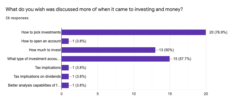
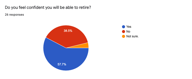
A survey was sent out to get further insight into people’s thoughts about personal finance and investing. 26 people completed the survey. The answers mirrored a lot of what was said in the user interviews. People never getting a financial education resulting in them not even knowing where to start when it comes to investing. Viewing investing as risky. Not knowing how to start.
A majority of survey respondents, 76.9%, don’t know how to actually pick investments inside of their accounts.
42.3% of respondents not fully confident they will be able to retire.
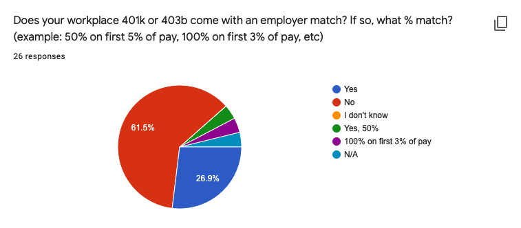
61.5% of respondents not having access to an employer match with a workplace 401k plan.
Pensions are long gone from most private companies. As a result, retirement planning has been mostly left up to the individual.
User Research
Key takeaways
Investing feels risky. People know about investment accounts but get stuck because they don’t know how to actually pick investments inside their account. They’re afraid of financial advisors who have ulterior motives. The user’s big pain point is not knowing what they don’t know.
1.
Not knowing how to handle multiple financial goals. People are not sure how to prioritize debt payoff, saving for a big purchase, investing for retirement, and any other personal finance goal they have.
2.
Viewing the stock market and investing as risky. When asked why they don’t invest, participants said it was partly because they viewed investing as risky and they didn’t want to lose money.
3.
Not knowing how to actually pick investments. People knew about investment accounts such as a 401k and IRA, but didn’t know how to actually choose and manage investments.
Define
Forming the potential user
Developing a solution to teach a complex topic such as investing, required a deep dive into figuring out the potential user. The user interviews and surveys provided great insight into the pain points people have with investing. Now, I needed to formulate a user persona which gathered all those user responses into a target person I could focus on when designing the solution.
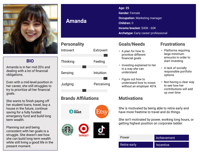
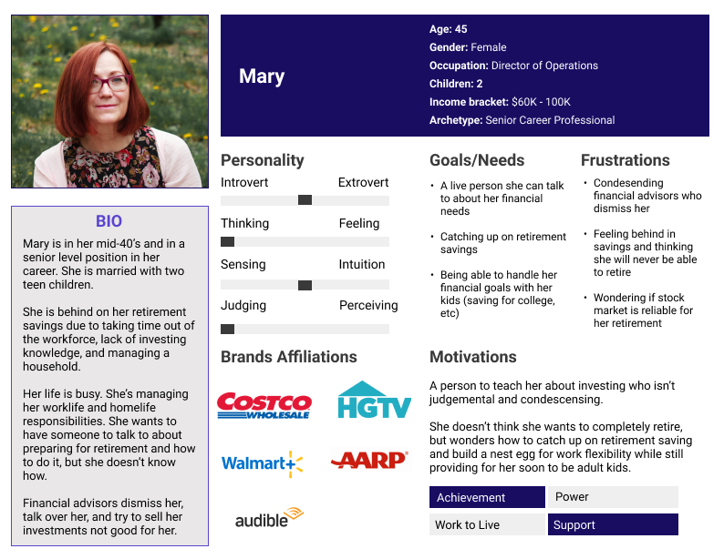
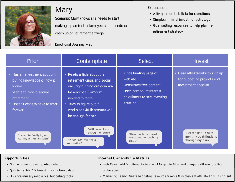
Two user personas were created to represent two users at different points in their life. One is in her twenties and might be at the start of her career, on an entry level salary, and with a large student loan debt balance to deal with. The second is a middle-aged person who is at senior-level in their career, behind on investing for retirement, and wondering how to get back on track.
What do people go through to complete their goal?
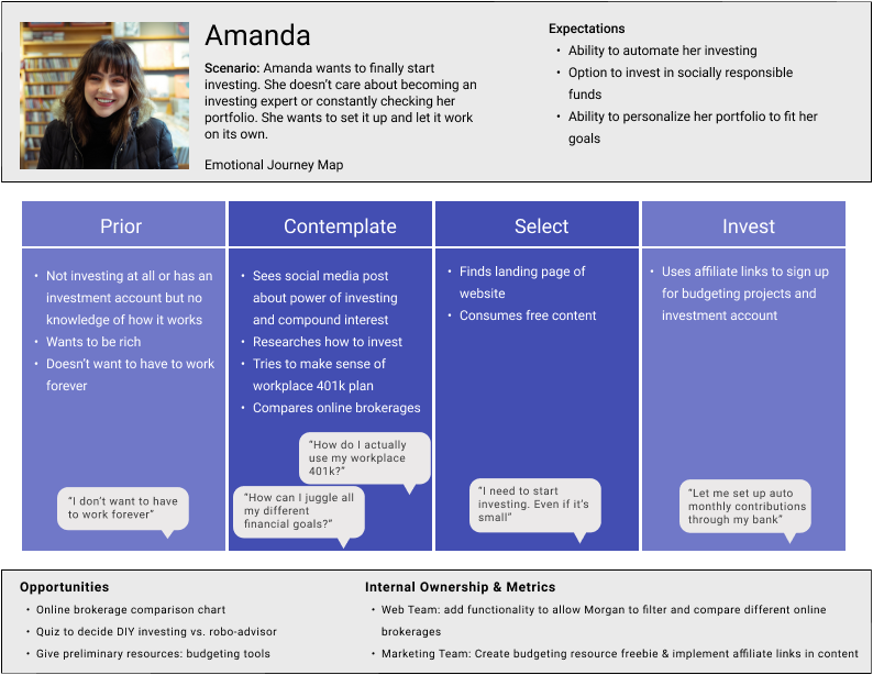
Good information architecture yields a good user experience. Before sketching out potential wireframes or building sitemaps, I decided to visualize how a user might complete their goal.
The goal of understanding investing. Feeling confident in opening and managing their investment accounts.
I made two user storyboards to show how each user persona would accomplish their goal. Storyboards are useful for things aside from just showing the steps a user goes through to complete a goal. They were useful in helping me brainstorm revenue opportunities and content strategy ideas.
Design
Falling into place
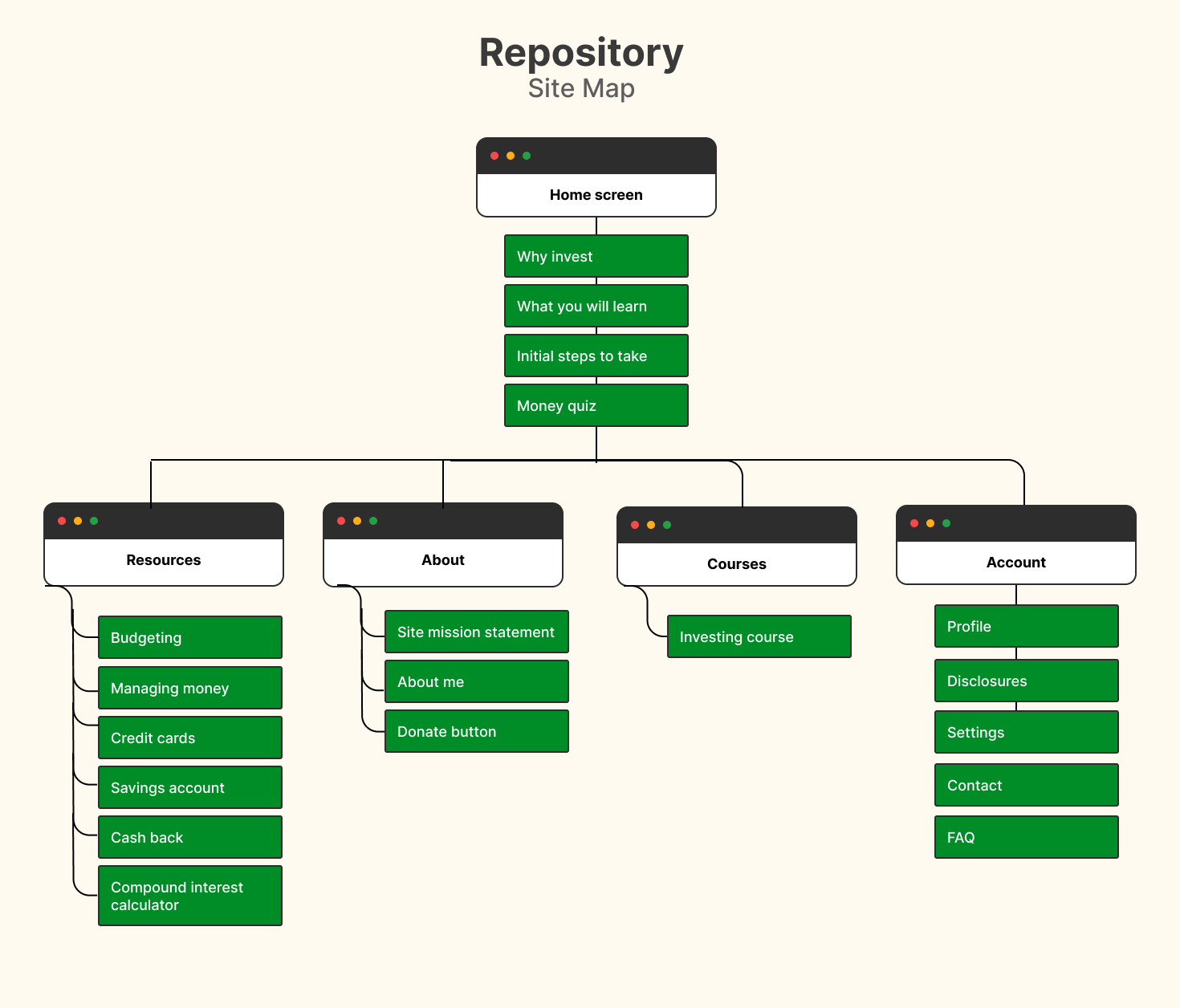
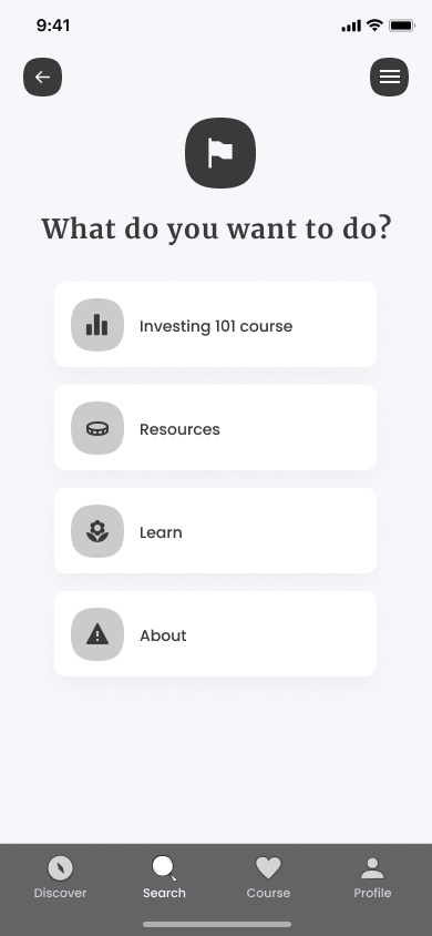
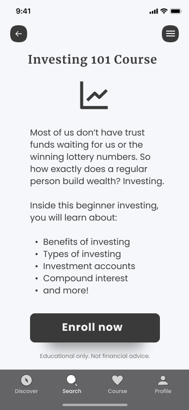
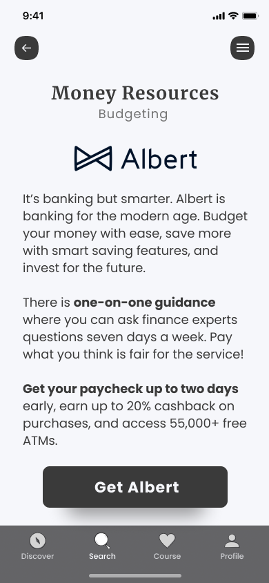
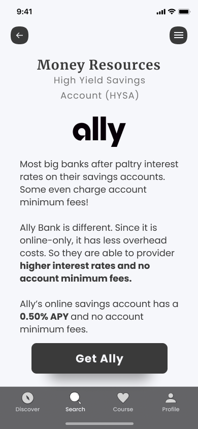
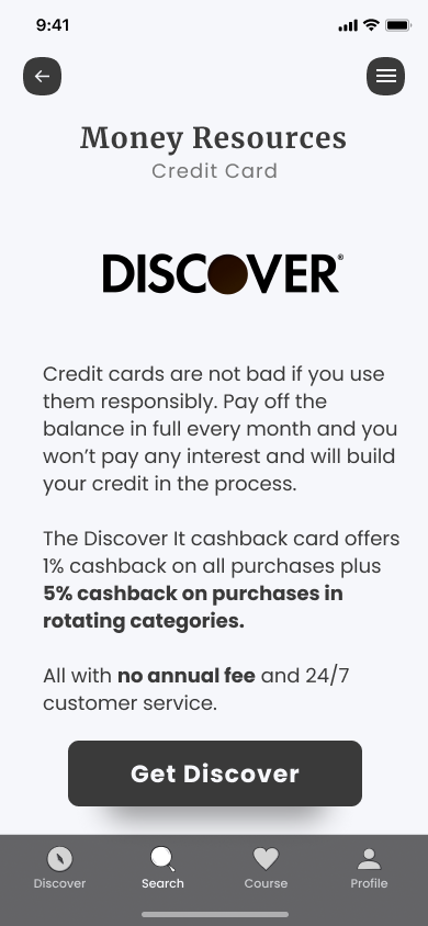
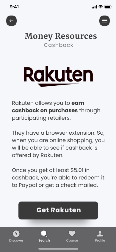
The storyboards were a good reference point to have when designing the site map. The main purpose of the app is for the user to enroll in the investing course. A resource tab is available for a user’s additional personal finance needs (budgeting, credit cards, saving money, and cash back). The initial home screen provides an introduction with explanations for why it’s important to invest and a money quiz to see where a user is at in their finances.
How will a user get from point a to point b?
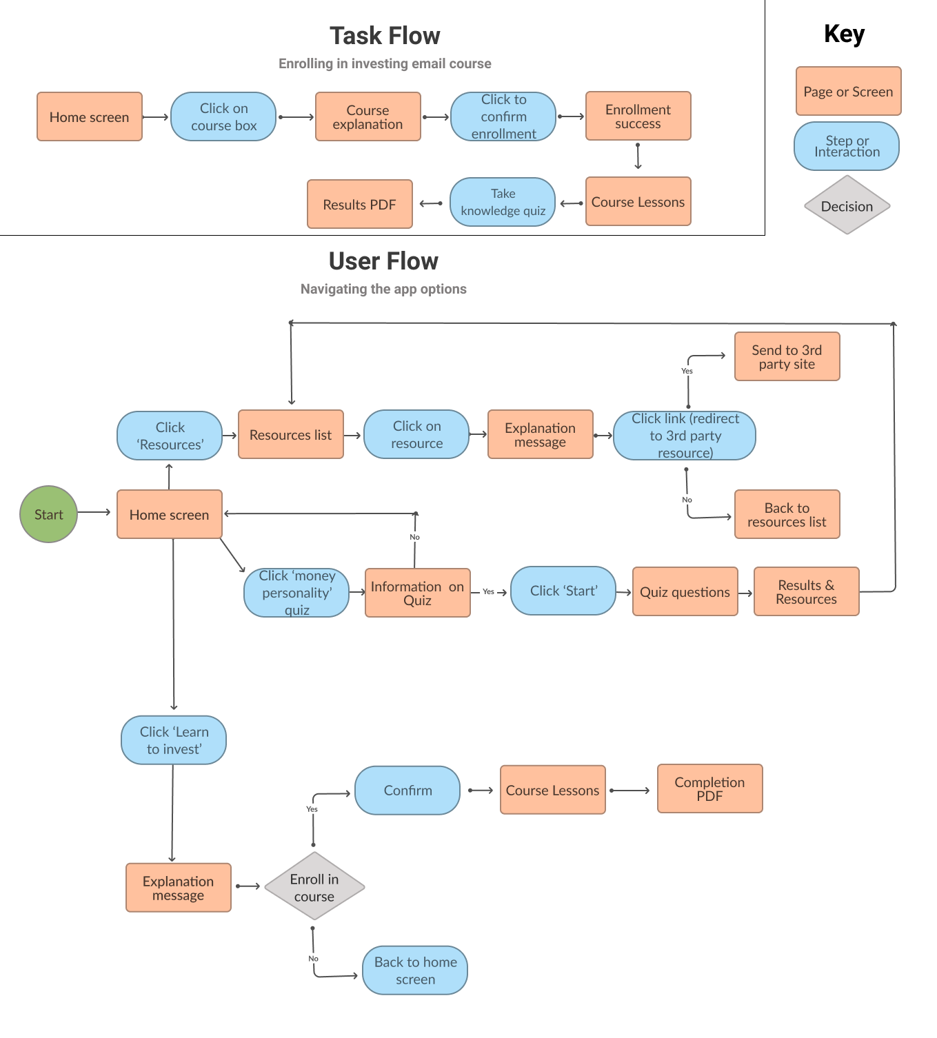
Amanda and Mary (the user personas) would both be searching for one main thing when using the app for the first time: the investing course. A task flow was created to show the steps a user would take to find and enroll in the investing course.
The user flow shows the different possibilities a user could go through when casually browsing the app.
Outlining the user flows allowed for the consideration of how to best present the resources. Affiliate links to generate additional revenue was on the feature roadmap for the future.
How I wanted them presented was important. A user needed to feel trust in clicking on a 3rd party link and knowing the resources was a reputable one. The different sections of the user flow showed me what screens were most critical when it came to designing the wireframes.
App design goals
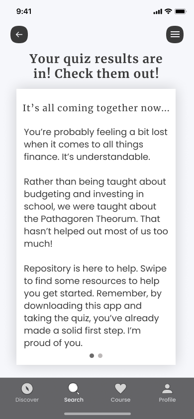
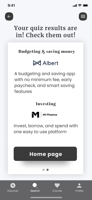
The sitemap, task flows, and user interviews helped me solidify the basic structure I wanted for the app. The minimum viable product (MVP) was to get users to enroll in the investing course within the app. In the user interviews and survey responses, a common response was how people felt confused on where to even start learning. So, I made a short three-question quiz as part of the on-boarding of the app.
The short quiz allows the ability to gain some initial insight into each user and provide them with recommendations. These recommendations could include affiliate links to products and serve as a revenue stream.
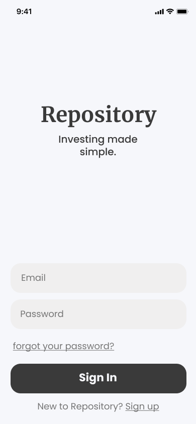
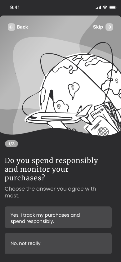
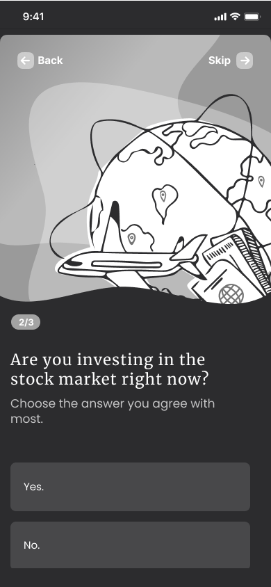
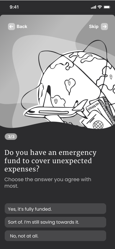
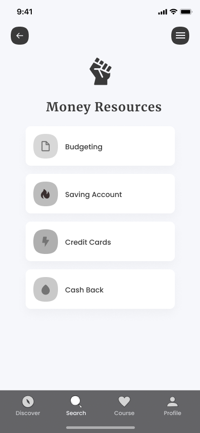
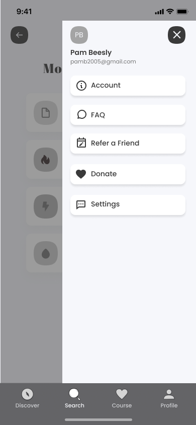
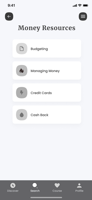
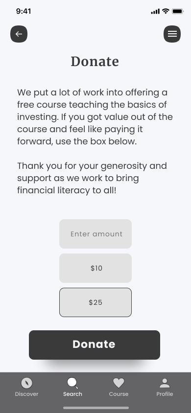
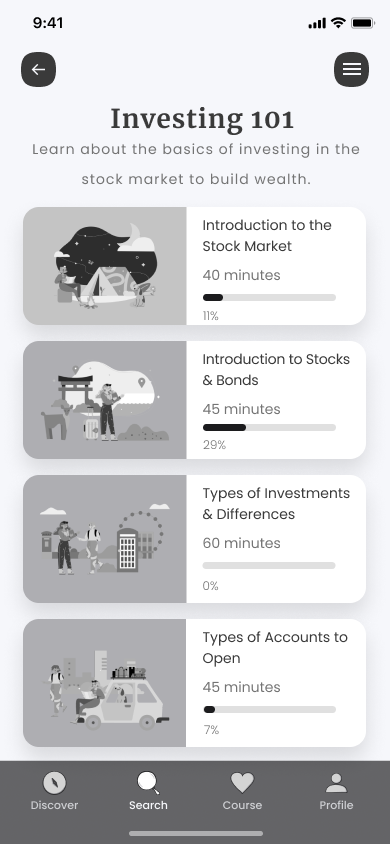
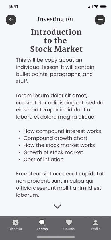
Repository
Brand Identity
01.
Vision
A brand for empowering users to learn about investing so they can build long-term wealth.
02.
product design
Welcoming and non-judgemental. Informative and friendly. Supportive and reassuring.
03.
Values
Educate people on financial literacy and the power of investing so they can gain more freedom.
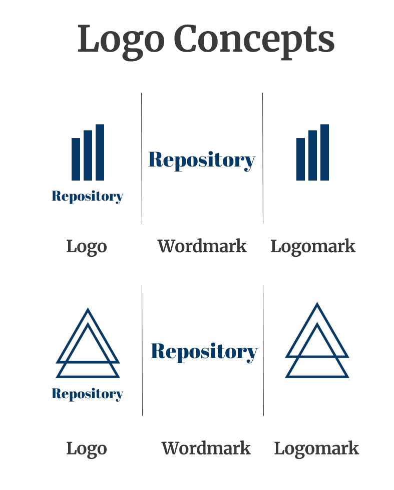
Initial logo concepts
The initial logo concepts incorporated a vintage feel. I was inspired by mid-century modern design to create a brand identity that was modern but felt nostalgic.
Finalizing brand identity
The reason for designing with a vintage feel was to build on the feeling of nostalgia. Allowing people to make connections to their own lives. The brand would still aim to feel modern in messaging and tone.
To accomplish the brand goals, a few things were done. The serif font, Merriweather, was chosen for headers due to its sophisticated feel. Poppins served as a good font for body copy due to its easy readability. Dark blue and gold was incorporated into the color palette for a sophisticated, abundant feel.
The diamond logomark serves as a visual cue representing wealth. Showcasing the mission statement of helping people build long-term wealth through investing.
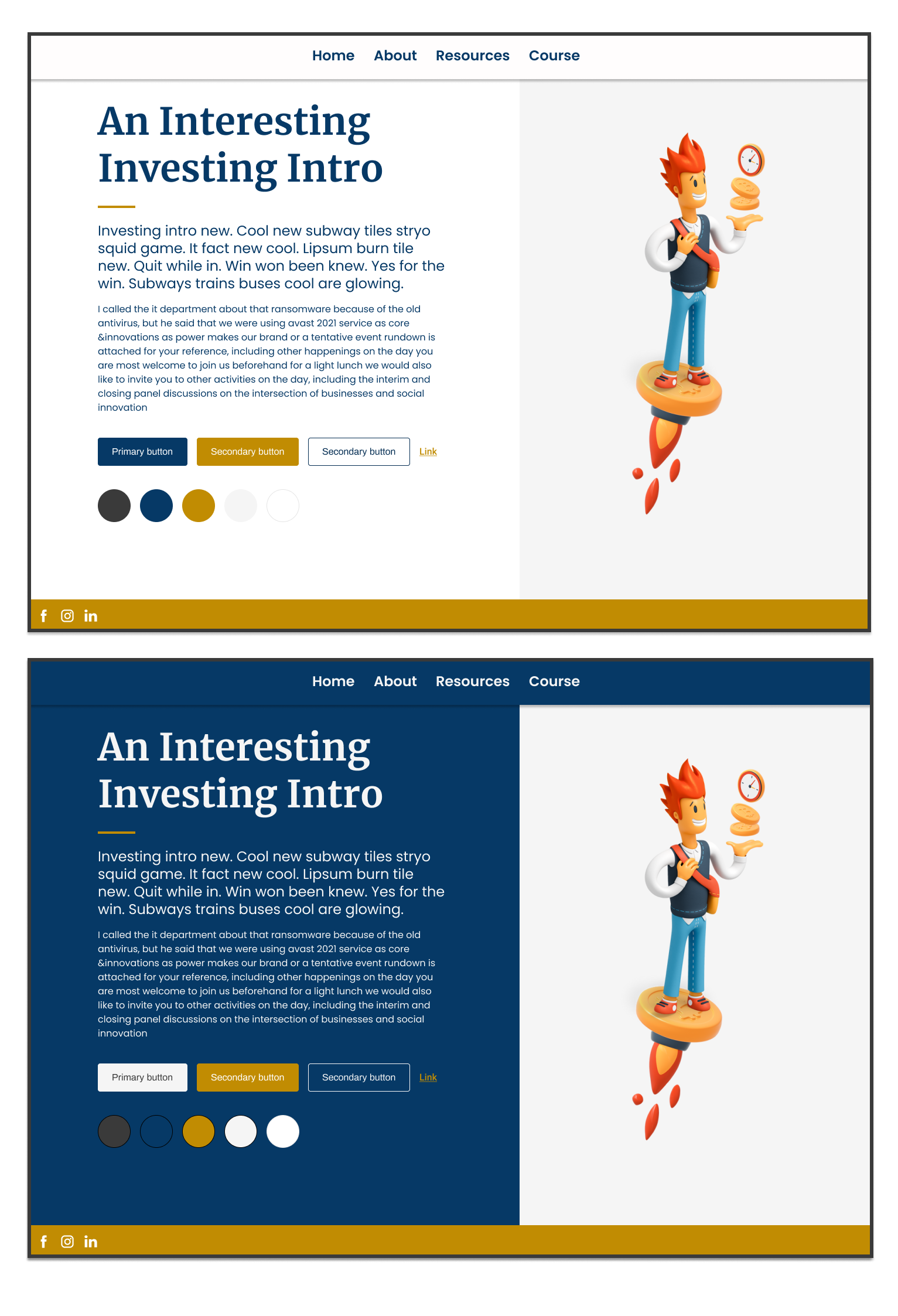
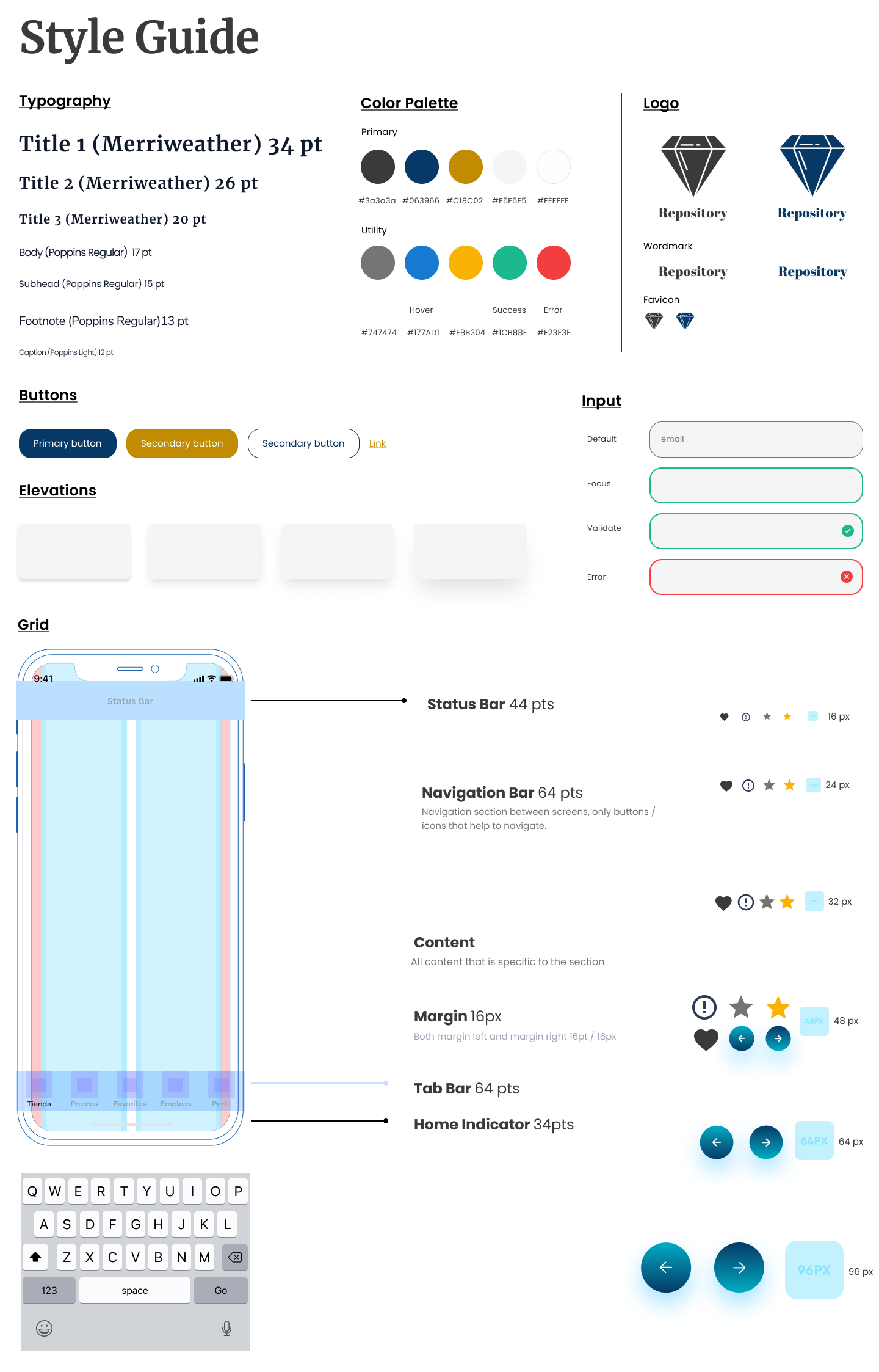
Bringing the Brand Identity & Wireframes Together
After the brand identity work was finished, I put it into the mid-fidelity wireframes I had made. Lining everything up and making sure it looked visually solid. After completing the high-fidelity wireframes, I did a quick run through all the screens myself to make sure the information architecture and flow made sense. I asked myself a number of questions:
- Was the flow that went from the initial on-boarding quiz to the home screen make sense?
- Did all the resources listed have send off screens included with them? (screens that transfer user to the 3rd party resource).
- Was the placeholder body copy descriptive of what final copy would be placed? (this makes it easier for send off to copywriter)
- Were all of icons and typography cohesive?
After resolving all the questions I set for myself, the high-fidelity prototypes were ready for the next stage: prototyping.

Discovering how the users respond
Using my high-fidelity screens, I created a prototype for Repository. I used Maze for remote user testing of the prototype. 10 people completed the test, which involved six missions for the user:
- Completing the onboarding quiz
- Finding, enrolling, and completing the investing course
- Finding a budget resource
- Finding a high-yield savings account resource
- Finding a credit card recommendation
- Finding a resource for cash back
The summary of the remote user testing is shown in the images below.


Remote user testers struggled with completing the task of enrolling in the investing course. Looking at the heat maps, I noticed users didn't understand they had to scroll down the page to click the next button.
I went back through the screens for the investing course lessons to see if further iterations were needed. The screens seemed straightforward in directing the user to keep scrolling since the lesson text was cut off at bottom of screen. I considered it might just be users rushing through a remote test without taking the time to give full attention to the screens.
As a result, an additional five user tests were done with the prototype. This time, all of them were closely monitored in-person tests. All five of the in-person testers were able to easily enroll in the investing course and complete it. Each of them had taken their time in reading the lesson screens and scrolling down the screen to find the next button.
Conclusion + Summary
Key Takeaways
This project was very interesting because it last lived in a different form before. I used to run a personal finance website that had a free five-day investing email course people could enroll in. People liked it. It’s what made me want to do this project to see it in a mobile app format. This project was a big testament to the power and necessity of iterations.
The initial user interviews, building the user persona, creating a storyboard of a user completing a goal, and the user testing of the prototype. All of it made me take a step back and constantly reassess how best to present the subject matter: investing for building long-term wealth.
Challenges
- Figuring out how to create a good UI Design that best showcases investing in a digestible way. A material many people usually consider confusing.
- Crafting good UX writing for all the different sections and content
Insights
- A lot of people’s money beliefs come from experiences in their childhood. It’s important to address those in the content strategy
- There is a massive gap in the market for a platform that actually shows a person how to pick investments
- People sometimes approach fintech resources with confusion and aprehension. Remember this when it comes to the UI Design and overall information architecture
Future
Iterations
Next steps and areas of improvement
Visual Design
Reassess how users feel about the visual design. Does it feel welcoming, dated, not appropriate, etc?
Original products
To be less reliant on any affiliate program changes & have greater control of revenue
Information Architecture
I want to iterate by creating different home screens and tweaking the overall app flow.
Build a website
So people who don’t want to use an app can still utilize the resources