No More Call Centers is a career services website geared toward call center employees who want to leave the industry and find new non-call center jobs.
The project was done out of seeing a need for a niche career services website.
Current career service platforms felt too general for call center employees. There was a strong need for a dedicated resource that specifically addressed call center workers pain points.
Develop a responsive website solution to help call center employees find new non-call center job opportunities.
Timeline
4 weeks
100 hours
Role
UX/UI Designer, UX Researcher, Visual Designer.
My goal was to give burnt out call center employees a career services solution geared directly to them.
Collecting the Initial Data
There are lots of career services websites available. Many of them are general and focus on helping people in all different types of industries. The brand language for the websites is for everyone.
I knew in the initial stage of UX research, I needed to keep target audience in mind: burnt out call center workers ready to leave the industry and find a new job. So the site would speak to one target group but still have information on several different industries.
Many people do not realize the difficult metrics and constant patronizing call center employees have to deal with in order to stay in good standing at their job. Dealing with back to back phone calls of angry, frustrated customers for eight hours a day. The pandemic caused call volumes to reach record highs during the initial stay at home orders (March 2020 – June 2020).
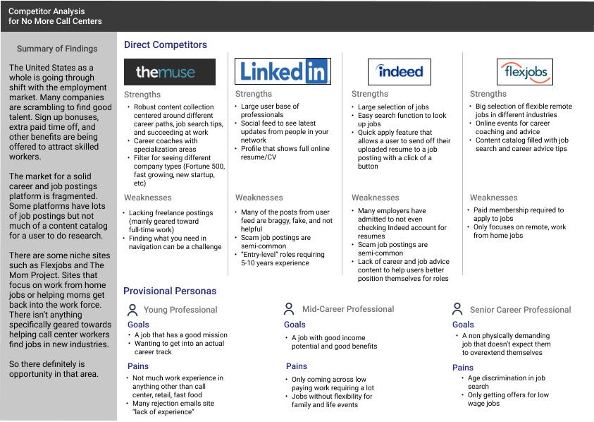
While doing a competitor analysis, I play close attention to the different feature sets of each one. Seeing how they would relate back to the target audience’s pain points.
The competitor analysis was a necessary step to document but the insight it gave was minimal. All of the four companies shown had very similar features and offerings. Something notable was how one of the competitors, FlexJobs, required a paid membership to apply to jobs. Doing so seemed to allow them to offer a better selection of vetted, no scam, quality job listings as well as the ability to limit distracting website ads. Allowing them to better focus on product offering.
It was something to seriously consider when it came to the revenue plan for No More Call Centers. If I were to make this into a real platform, would revenue from website ads be enough with a rising number of people using adblocking services?
User Interviews
I was interested in understanding how individual people felt about when it came to career service and job listing platforms. Doing user interviews was very important for at the moment in time due to current trends. In 2021, the phrase “The Great Resignation” was coined in response to many people quitting their jobs to pursue higher paying ones, launch a business, or go through a career change.
There started to be an increased interest in talking about career changes, how to sell yourself to HR, salary negotiation, financial aspect of changing careers, and more.
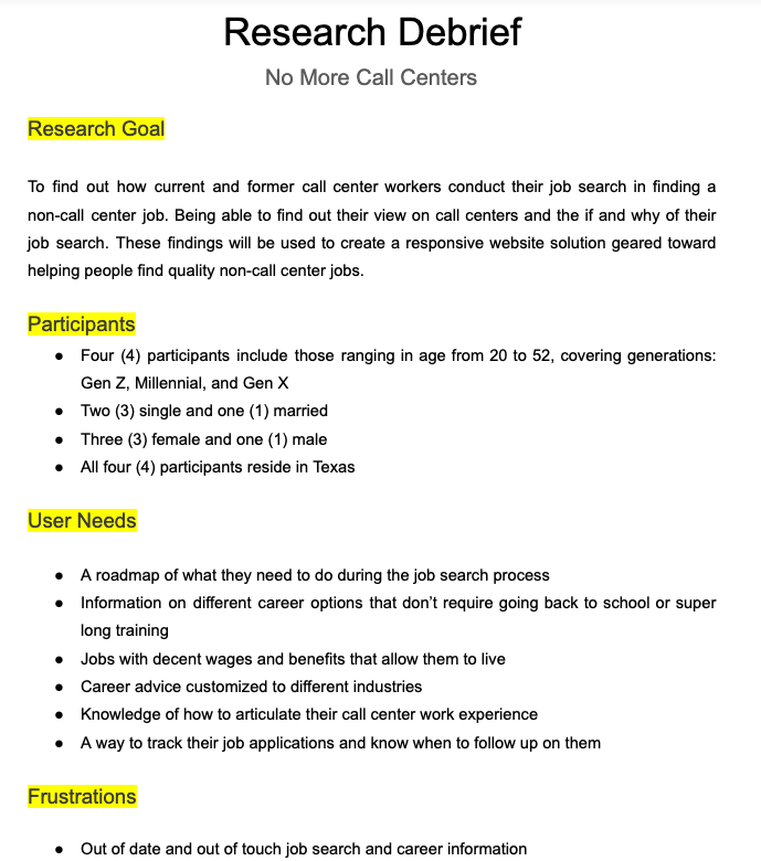
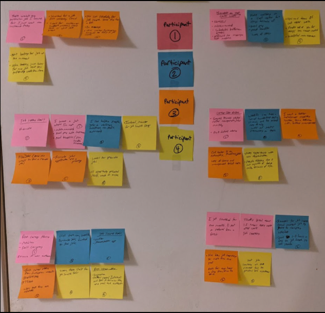
Four user interviews were conducted with participants ranging in age from 20’s to 50’s. All four participants either currently worked or formerly worked in a call center setting. The user interviews can be found here and the research debrief with affinity map can be found here.
People want a roadmap to help guide them. A way to track their progress. They want to see job listings that have pay transparency. Information on good-paying jobs that don’t require going back to school.
Making a User Persona
After completing the user interviews, I had a good understanding of the key needs people would have when it came to a career services platform.
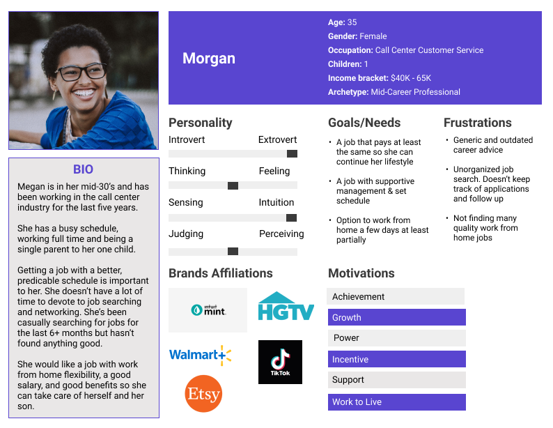
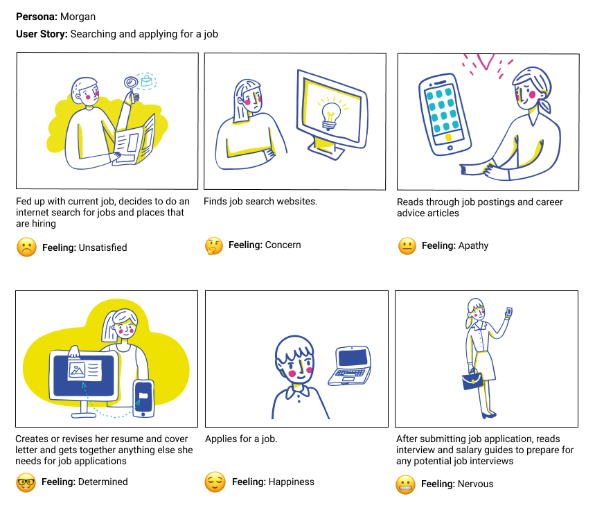
The user persona of Morgan was created.
Morgan is a mid-30’s woman who strongly desires to find a job that pays around the same or more than what she is currently making at a call center ($40k-60k USD).
She is an extrovert who relies on her intuition to make decisions. She is someone who desperately needs some organization when it comes to her job search.
Leading a busy life, she’s not sure if she can go back to college due to time commitments and financially.
Looking at this user persona, some key opportunities for revenue generation moving forward could be digital products such as a resume and cover letter templates, and a job application tracker. Affiliate links for career and financial resources could also be incoporated.
Understanding User Flow
With the secondary research, competitor analysis, user interviews, building a user persona, and accounting for all the project goals, I was still left curious about how a user might go through the website once it’s built.
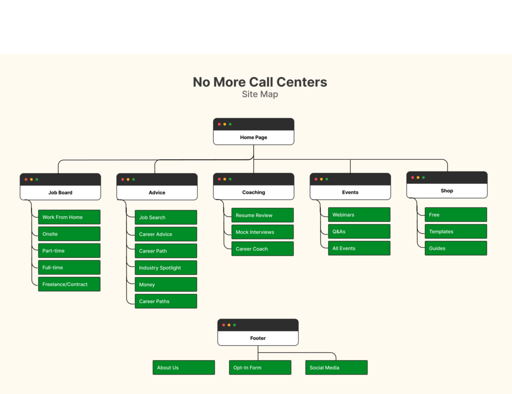
What is the first thing a user would notice or click on? How would they feel while navigating through the site? Emotions influence a lot. I wanted to understand them. So I made a storyboard to visualize what a user goals through to complete a goal. A sitemap was completed to be a framework showing different pages and navigation for the website.
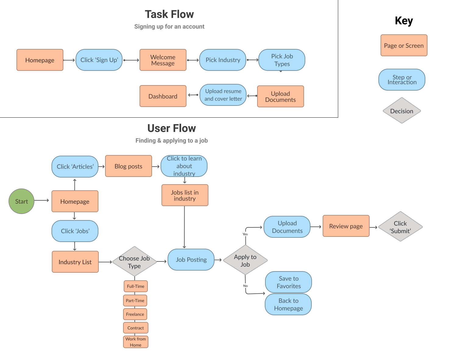
After completing a storyboard and site map, I moved on to making a task flow and user flow. There needed to be a document that showed the general flow everyone would be going through (task flow). The user flow was made to understand the different paths a person could take after reaching the website homepage.
Looking at the user flow (below), you can see several ways a user would get familiar with the brand before deciding to utilize it by buying digital products or applying to a job role listed on the site.
Defining the Product
Figuring Out Project Goals
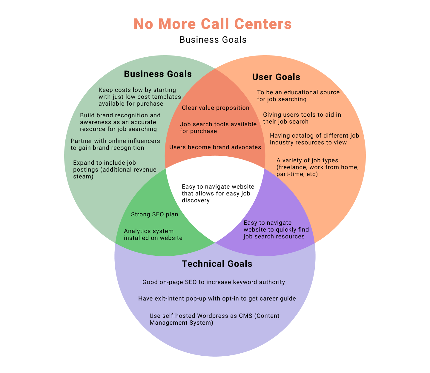
I always make it a priority to stop and reassess the user goals, business goals, and technical goals. Figuring out how they all fit together.
Documenting how all the different goals fit together allows for amore seamless UX process. It allows for all sides to be looked at.
I created a Venndiagram to explore the intersection of user goals, business goals, and technical goals.
Having a product goals document completed, I made a feature roadmap to see what needed to be prioritized first.
Visual Design
Figuring Out the Visual Layout
Everything completed so far, there was a good foundation of understanding the users, their pain points, how they could possibility interact with the site, and the information architecture of the site. Doing the competitor analysis during the research stage, I noticed all the competitors had sites with lots of information. The increasingly popular design trend of simple, minimal design would not be the best fit.
However, this website solution was for a career services platform at the beginning stages, not some redesign of an existing established brand. So, a simple design would work. It just needed to scale for any new future offerings.
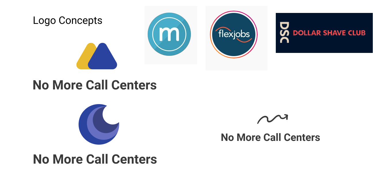
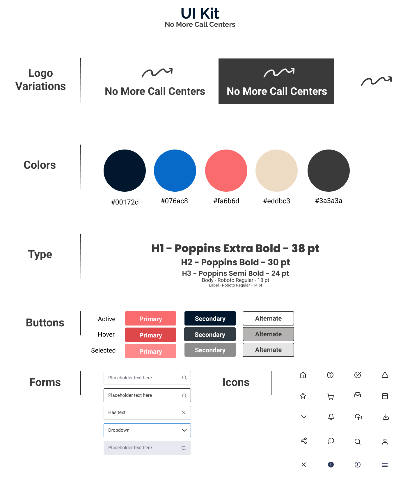
There were many different thoughts around how the logo should be. The competitor logos had curved lines, boxes, or just a simple wordmark. I wanted the logo to feel friendly and signify the journey toward getting a job you’re content with. Figuring out how to get this message across took a few iterations.
Interestingly, a lot of the inspiration while designing the logo came from fintech applications such as Tiller, One Finance, and YNAB.
Logo Concepts
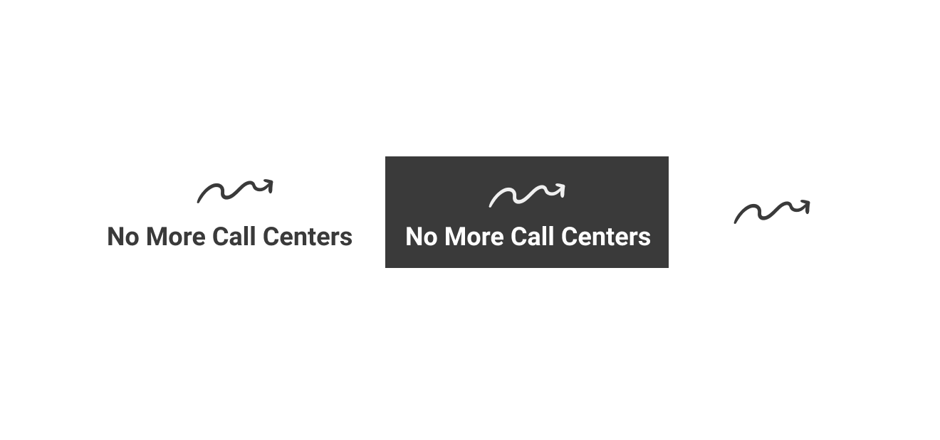
Final Logo Set
Completing the Full UI Kit
I completed a UI Kit to use as a general reference guide for typography, color, and button design. A soft red was chosen as part of the color palette for use in buttons to help increase clicks. Having red for the button color would help invoke a sense of urgency for the user to click. Poppins was used for header font due to its clean style that allows for easy readability. Being a serif font, it gives a professional yet friendly vibe when paired with the rest of the visual design.
The logo represents the nonlinear path of progress and success. It shows if you continue working, you will keep moving onward and upward.
High Fidelity Wirefames
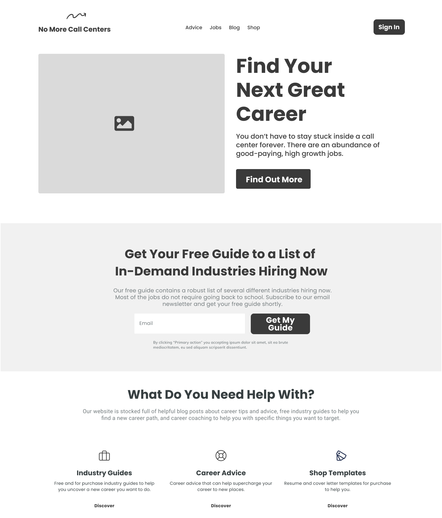
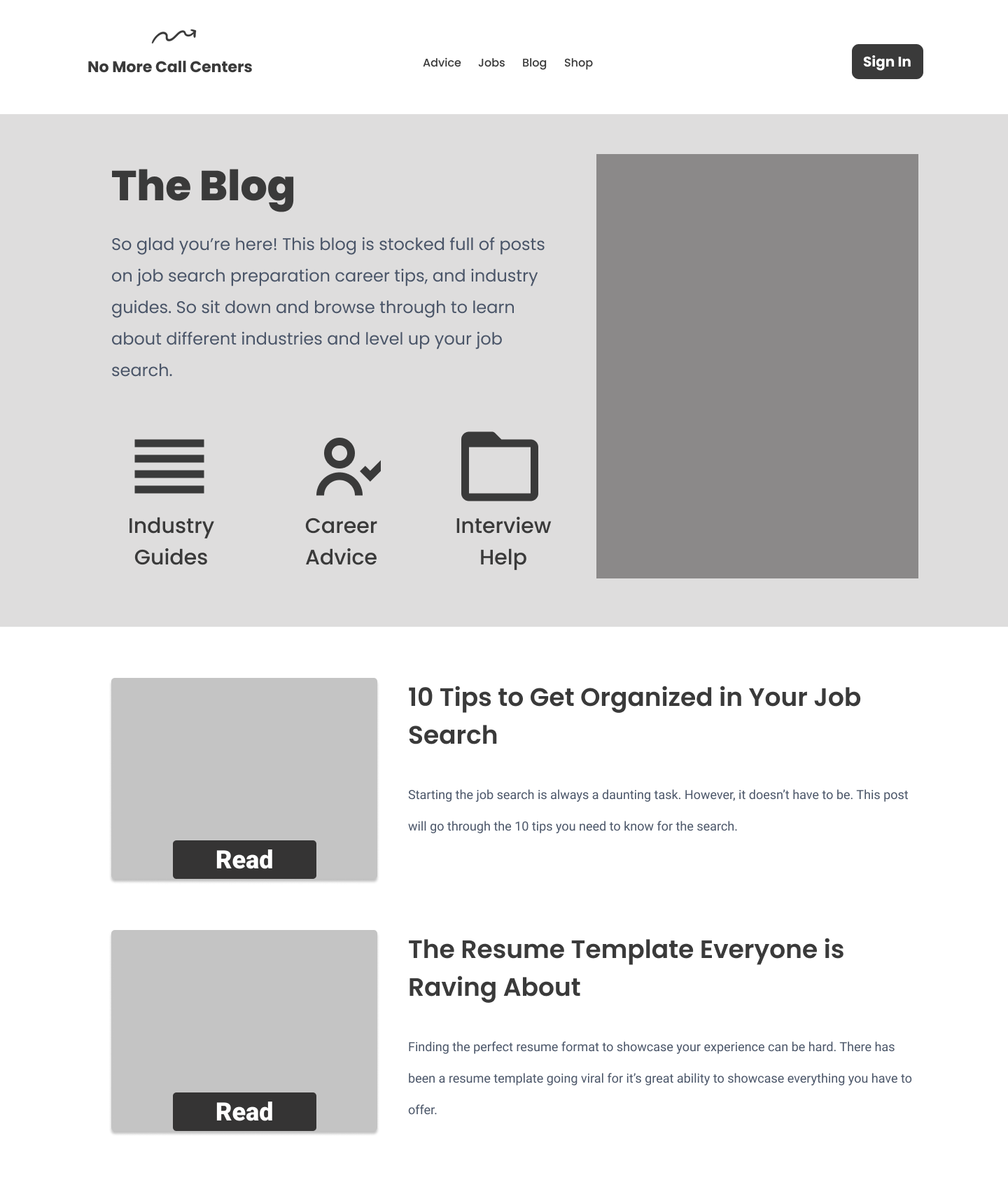
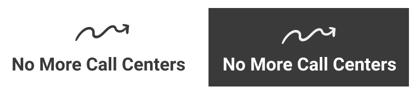
Putting all of the designs together, I made the high fidelity prototypes. The illustrations have a depth and cartoon aspect to them to give a casual, friendly feel to the site. Viewing the screens and the prototype, you will see the initial goal of the website is to offer industry guides, career service advice, and 1:1 coaching.
If this were a real solution, the goal would be to build a user base at first and then expand to include more offerings such as a job board.
I was finally ready to get the prototype into user hands to test. I wanted to do user testing with the high fidelity prototype to test how well people understand and can accomplish the two important task flows of the website:
Discovering new job industries through job search guides and blog posts
Finding and using digital products such as resume/cover letter templates and degree free guide
I conducted the usability testings in real time, watching all five participants individually. Each participant was able to accomplish both task flows with relative ease without any prior instruction on what the task flows were. There was some feedback given by each of them.
Feedback
Three of the five participants said they were confused at first about the purpose of the ‘discover’ buttons on the homepage. They didn’t notice them at first.
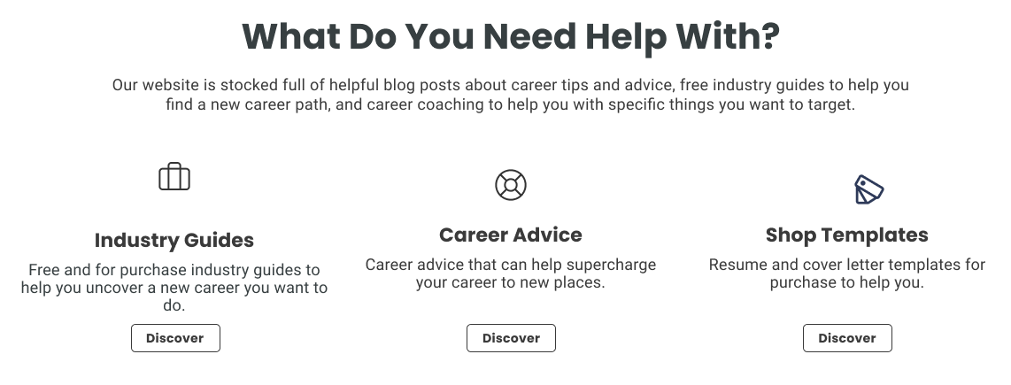
One of the five participants was unsure what clicking the ‘let’s go’ button on the homepage would lead to. Would it lead to a product page? Career booking service?
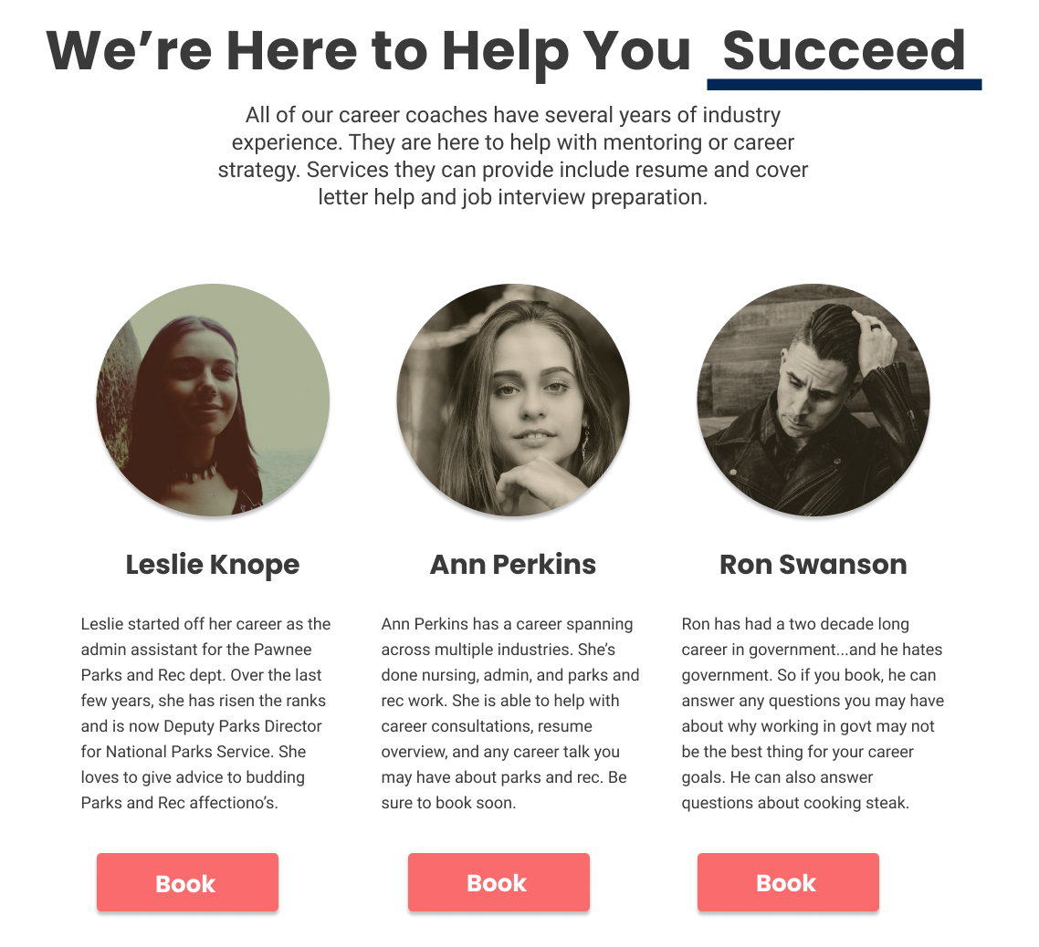
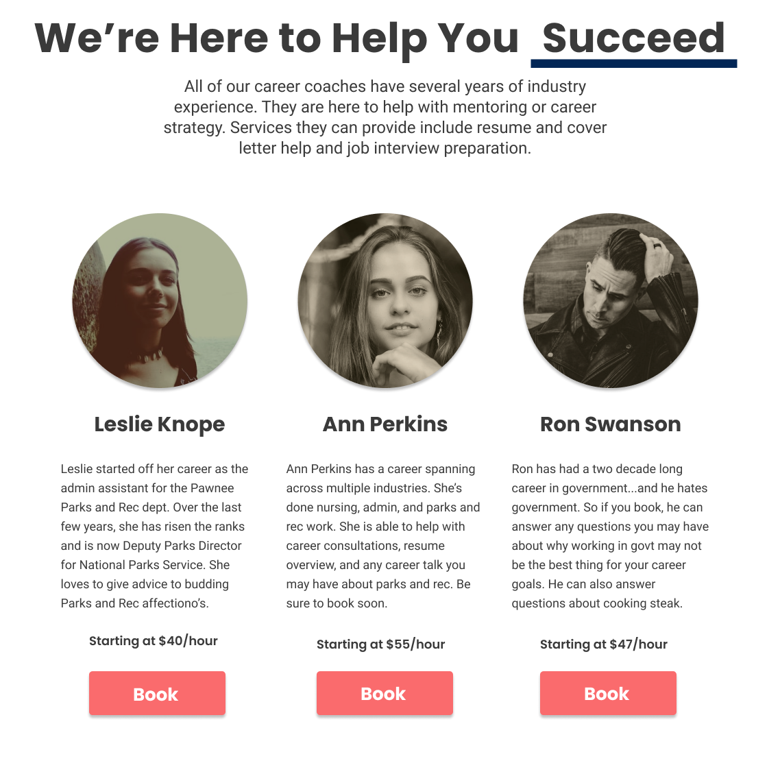
All five participants mentioned maybe having the pricing listed next to the book button for each career coach.
Revisions
Prioritizing Iterations
The feedback on the ‘discover’ buttons and ‘let’s go’ was helpful but I didn’t see a need to iterate them. The ‘discover’ button only caused initial confusion before all participants got it. It’s contrast against the higher priority buttons is needed.
The paragraph above the ‘let’s go’ button gives context of what a user would be going into. Once participants actually read paragraph, they felt more confident in pressing the button.
The career coaching page was iterated on to include pricing. If this were to be made into real website, I would want to a/b test the effectiveness of not showing pricing on initial page vs. showing it.
Learnings & Takeaways
Working Solo Has Limitations
Working on a UX project as the sole designer is challenging at times. With no other stakeholders present, it can be very easy to veer off track and end up with a case study that is not impactful. Having the assistance of a design mentor and weekly critique sesssions with other UX Designers was extremely helpful. It allowed me to stay on course and get valuable feedback on deliverables. Feedback I could use to influence decision making moving foward.
Mindset Needs to be Addressed
A big takeaway from this UX project was how important it is to address a person’s mindset when it comes to helping them in their career. A lot of career service sites do not seem to fully address this. It’s so easy to get caught up in just having a content strategy filled with listicles and general advice.
During the user interviews, I learned a lot of people just don’t feel fully confident in themselves to apply for that certain role they want, ask for the raise they want, and more.
There needs to be more:
Content focused on developing emotional intelligence, addressing limiting beliefs, and how to stay disciplined
Services tailored toward specific job industries (so there is more specific, helpful advice)
Conclusion
Overall, I’m satisfied with how this UX project turned out. I learned about the pain points of job seekers in a specific area (call center workers). The prototype had positive feedback. I hope to find new niche areas to develop potential solutions for.