Salin is an established insurance company with more than 30+ years in the business. Their primary way of selling insurance products is in-person, through regional agents.
Customers can pick through a selection of prepackaged policies with access to some slight customization.
With the rise in internet and mobile first usage, Salin has been losing ground in the industry.
Develop a solution to help Salin increase its web presence and make it easier for customers to shop and buy insurance policies online.
Timeline
4 weeks.
100 hours.
Role
UX/UI Designer, UX Researcher, Visual Designer
My goal was to give users a simple and intuitive solution to buying insurance.
Keeping Salin’s long standing reputation in mind.
Understanding the Habits of Users
My tasks in understanding users was doing a combination of secondary research, competitor research, and user interviews. I learned quickly that many people have an overall skeptical view of insurance. They do not want to get left behind when they need to utilize their insurance. Price and benefits were among the top considerations when selecting a policy.
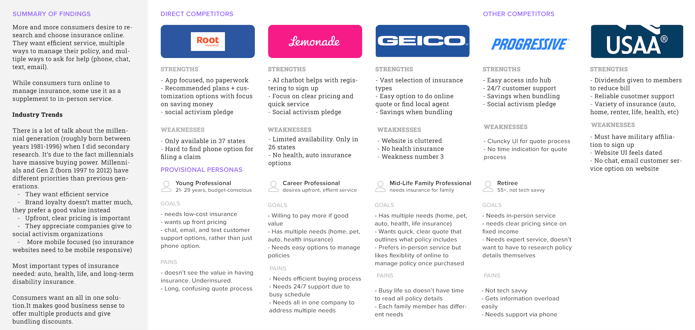
From there, I identified key competitors in the insurance industry. Some of these competitors are companies that also have a long standing reputation in the insurance industry. Others were newer companies that have popped up over the last few years and exploded in growth. A competitor analysis was put together to identify the strengths, weaknesses, and target demographics for each company.
The competitors listed below had varying strengths in areas Salin insurance didn’t. However, many of competitors also had limitations in terms of product offerings, website usability, and brand messaging.
User Interviews
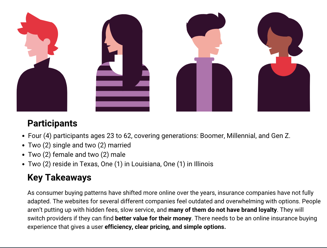
After doing the competitor analysis, I had a good foundational understanding of the insurance industry and opportunities there were for improvement. To get a personal understanding of user pain points and desires, I conducted a series of user interviews.
The objectives of the user interviews were to see what real people’s past experiences with insurance buying had been, how they felt about the quote process, shopping different providers, and they’re overall feeling toward the insurance buying task.
The interviews were conducted remotely via video calling. Doing it over video allowed for me to pick up on subtle body language cues users had when giving their answers.
The full research findings report can be viewed here.
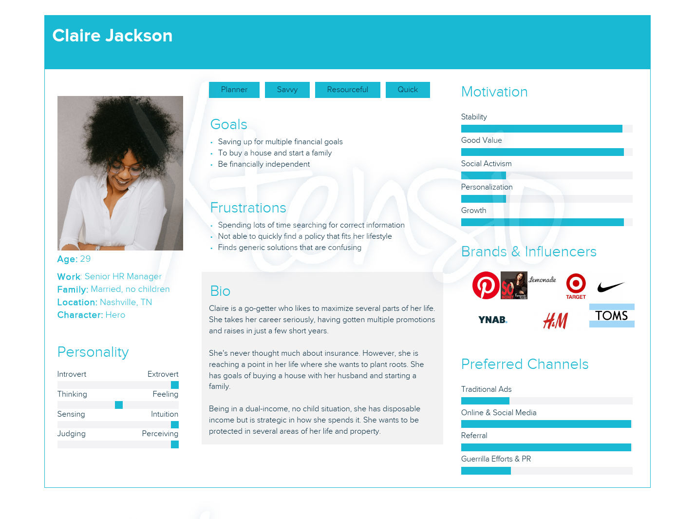
User Persona
It was clear from the user interviews that insurance companies have not been doing the best job at connecting with customers.
Many people today want clear pricing, dependability, and a robust online solution to managing their insurance so they don’t have to always speak directly with a live person.
I crafted a user persona with all this in mind. The persona helped serve as a reference point when it came to creating the brand identity for Salin Insurance.
The persona of Claire encompasses the pain points uncovered during the user interviews. The persona is a busy person, wants clear messaging, and likes a company that makes things easy to understand.
Clear pricing is a top desire
People are done with having to put up with hidden fees and add-on upsells that are thrown at them before the final checkout.
Feature rich online account management
People don’t want to have to call someone to get things done. They need to have option to file claims and make changes themselves.
Transparency builds brand loyalty
People appreciate it when their provider is transparent about how their premium is used. They like it when companies practice social activism.
Defining the Product
Establishing Project Goals
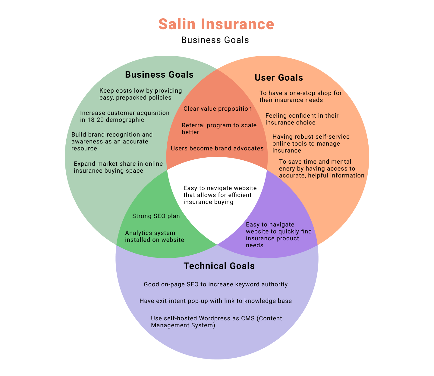
After completing the secondary research, competitor analysis, and user interviews, I had a good understanding of user needs and pain points.
I made a Venn Diagram. To help keep all considerations in mind as I moved into defining the product.
Doing this allowed stakeholder goals to be kept in mind during the product build phase.
Prioritizing the Feature List
Now having all the stakeholder goals considered for, I created a comprehensive list of all the envisioned product features. Features were sorted by priority with the minimum viable product (MVP) features listed out first. On the product roadmap, each feature lists it’s purpose as well as the research to support its necessity.
Many of the features such as a knowledge hub, AI chatbot, and document upload feature I wanted to incorporate into the high fidelity mockups. Users expressed interest in having these. However, each of these features can be very time intensive to build. A knowledge hub would require regular ongoing additions.
Keeping business and technical goals in mind, the minimum viable product didn’t need these. They could be added later. In the feature roadmap, they are labeled for a future iteration phase.
Information Architecture
Having Users Decide the Most Intuitive Layout
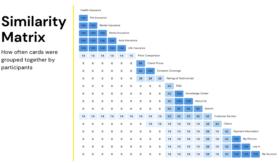
Salin Insurance has a large range of insurance products. So, getting the information architecture constructed well, without overwhelming the user, was critical. After finishing the feature roadmap, I conducted a card sorting exercise with seven (7) participants. The exercise involved each participant sorting through 20 cards. Clustering ones together that they felt were related.
Doing this allowed for me to see how users associate insurance products with one another as well as different tasks with one another. The full findings report for the card sorting exercise can be viewed here.
Key Takeaways
Cards were commonly sorted into four (4) categories: insurance type, about, contact, and coverage price
“Compare Coverage” card was categorized under “Help”
Participant suggestion: change “check prices” to “get a quote:”
Participant suggestion: Have a knowledge resource that is clearly labeled toward first timers or people that don’t know a lot about insurance.
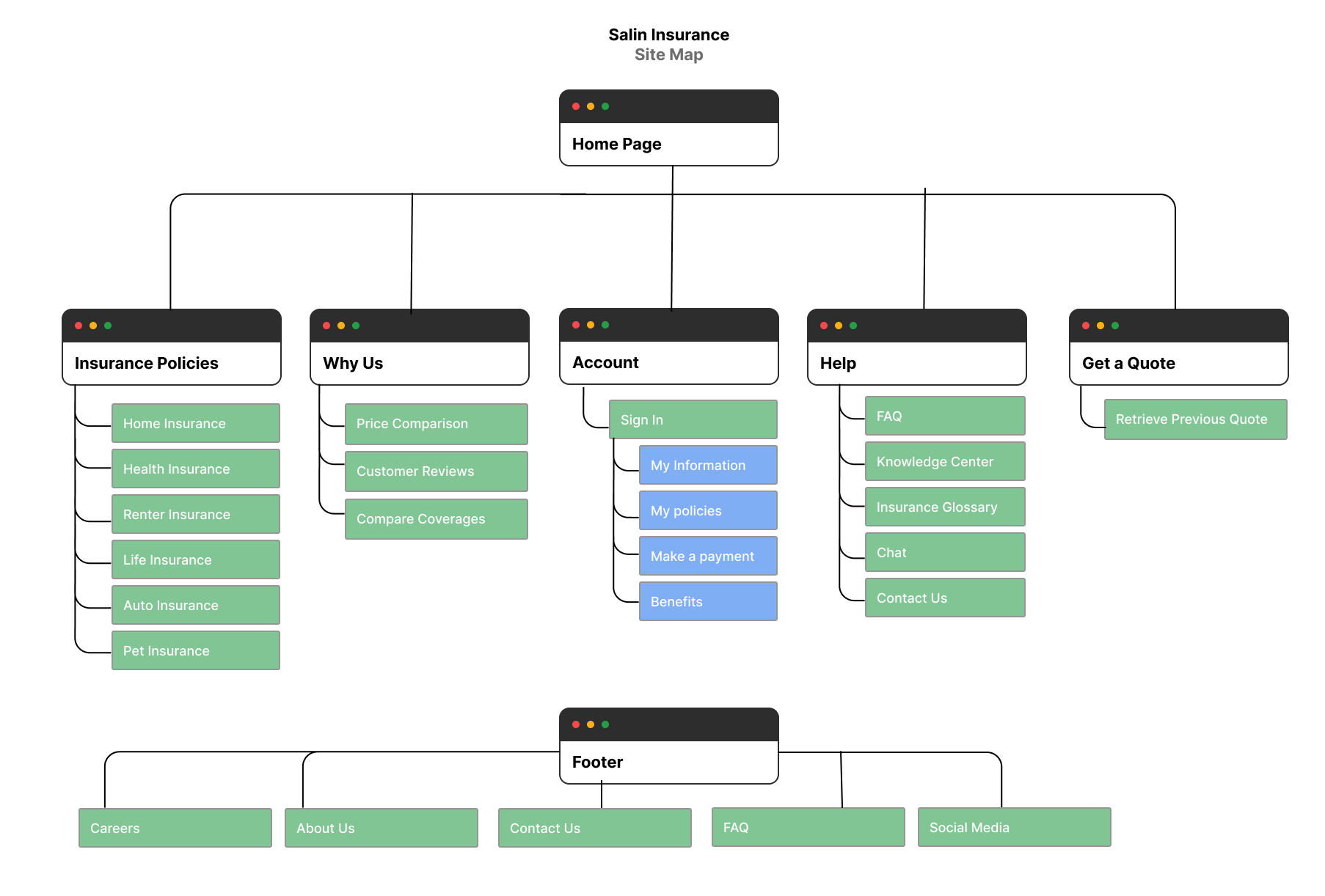
Creating the Site Layout
With the results of the card sorting, I was able to put together the structure of the website. The sitemap became a good point of reference to have when building the website mockups.
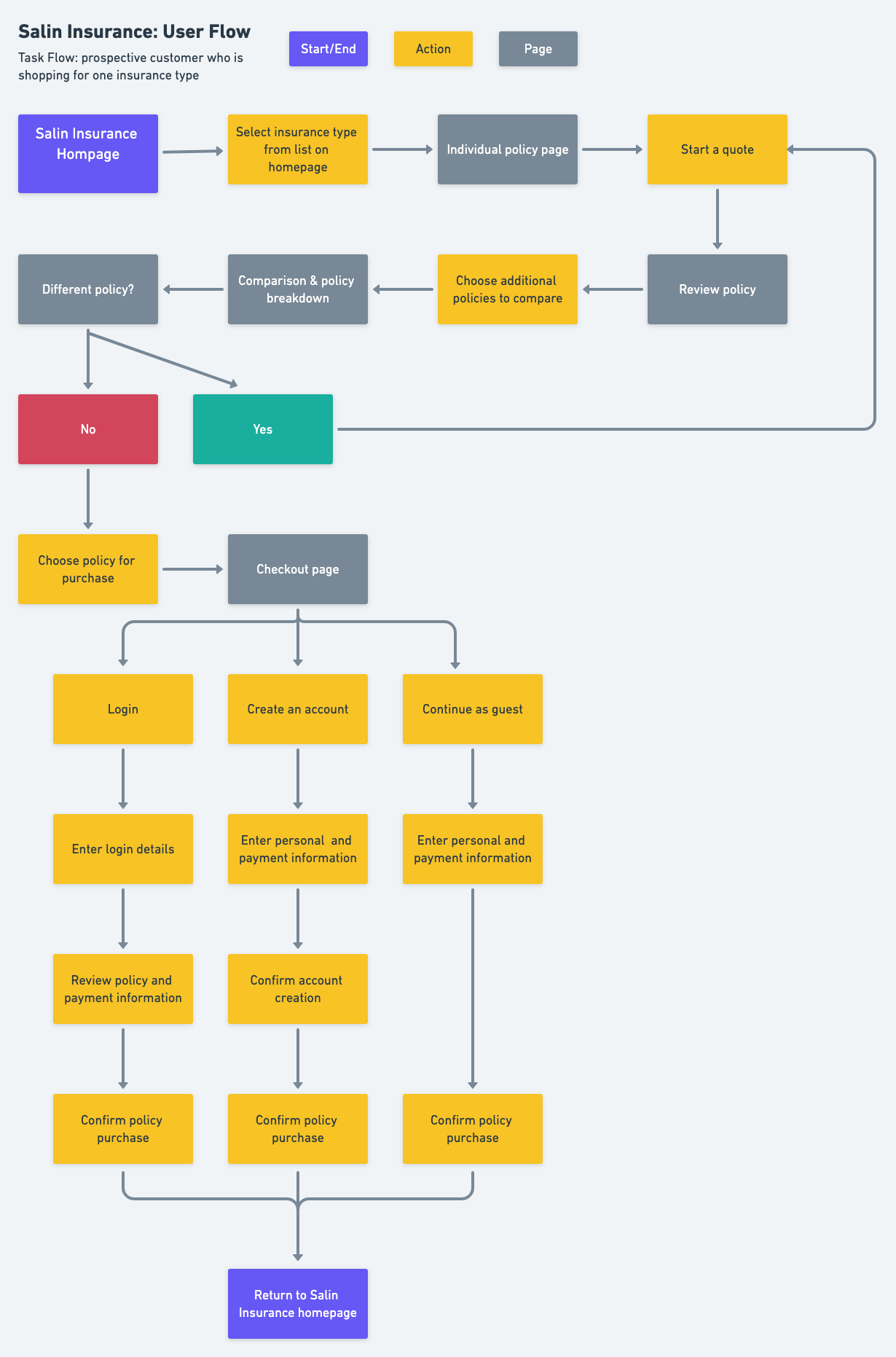
Creating the User Paths
I created a user path to showcase how a user would possibly interact with the site. From the time they first land on the site to navigating through it.
Since users often comparison shop for insurance, there would be a high probability they would arrive at the site from a comparison website or via a website display ad. I kept that in mind while making the user path.
Having the user path on hand, I was able to make better design considerations for pattern placement and visual hiearchy in the mockups.
Visual Design
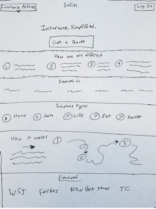
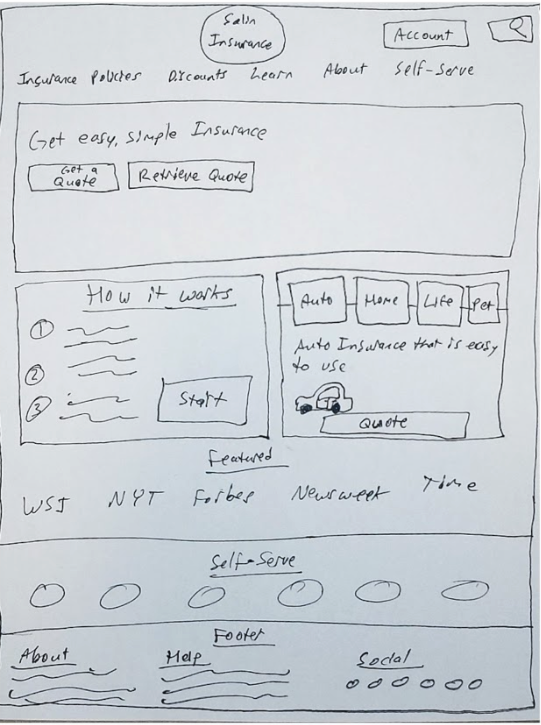
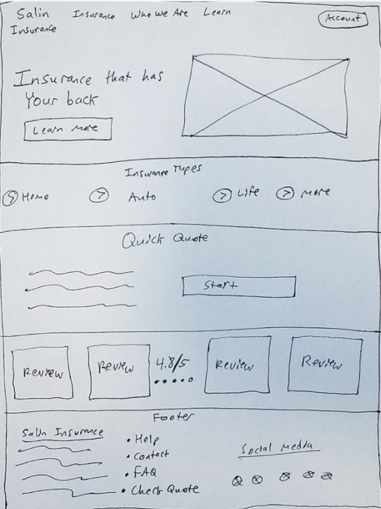
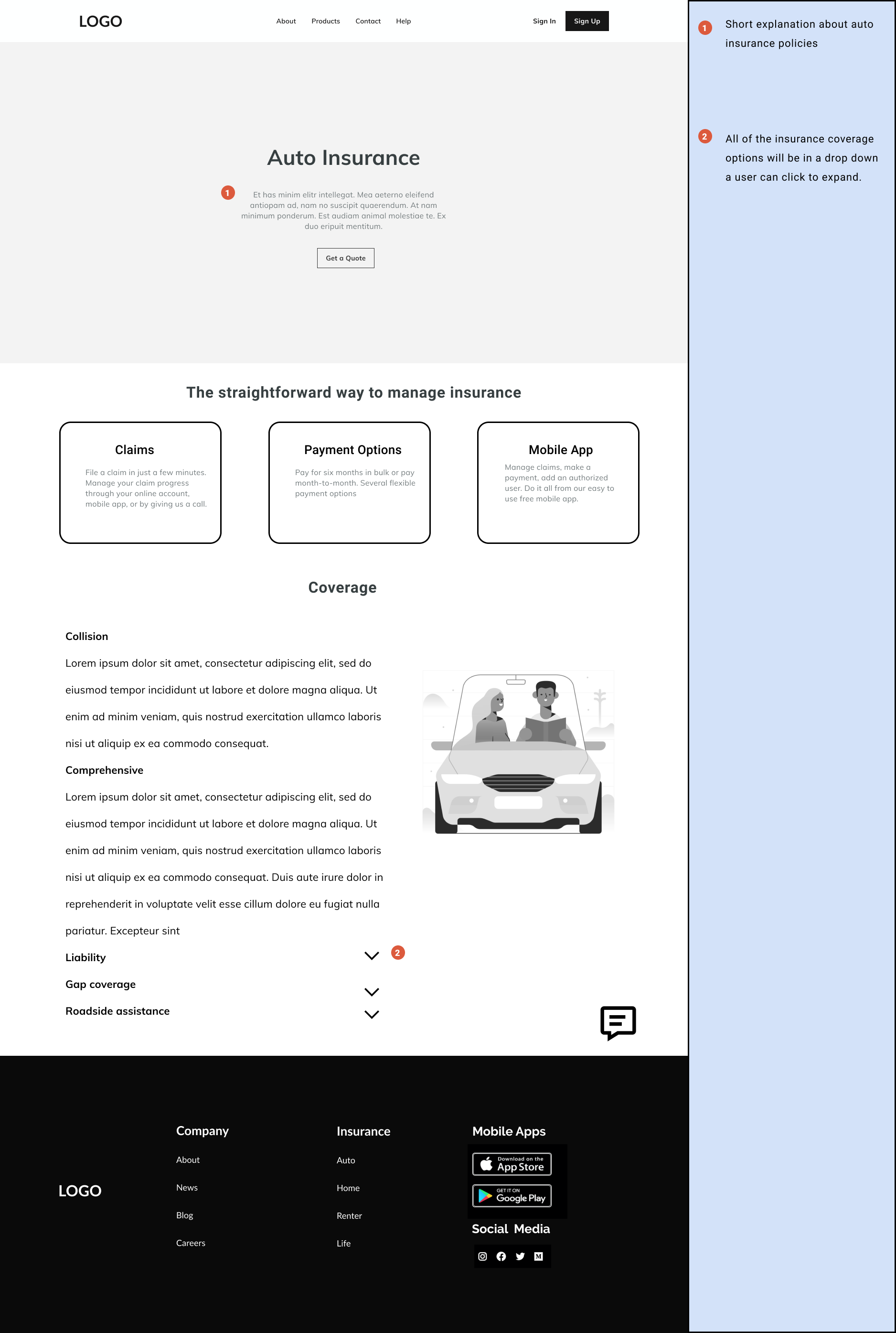
With a completed site map, user flow, and the insights from the card sorting exercise, I had a good foundation for design considerations including pattern choices and visual hierarchy. I created some initial hand drawn sketches to get a feel for what layout would work best. The user needed to feel comfortable and at ease when they navigated the website.
So, I the hand drawn sketches have a main call-to-action (CTA) in each of them, rather than a busy top section cluttered with product descriptions, getting a quote, and more. The sketches also feature a section for testimonials and a short explainer on how Salin works. Salin has a long standing reputation for in-person service. However, I included the short explainer section so more digital-first users (who this project is for) who may not be familiar with Salin at first, can get a quick general idea.
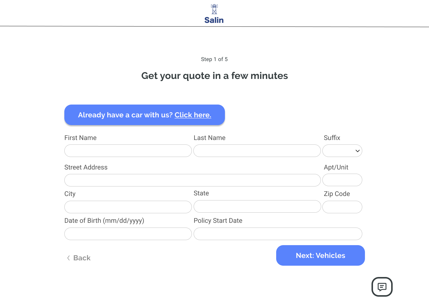
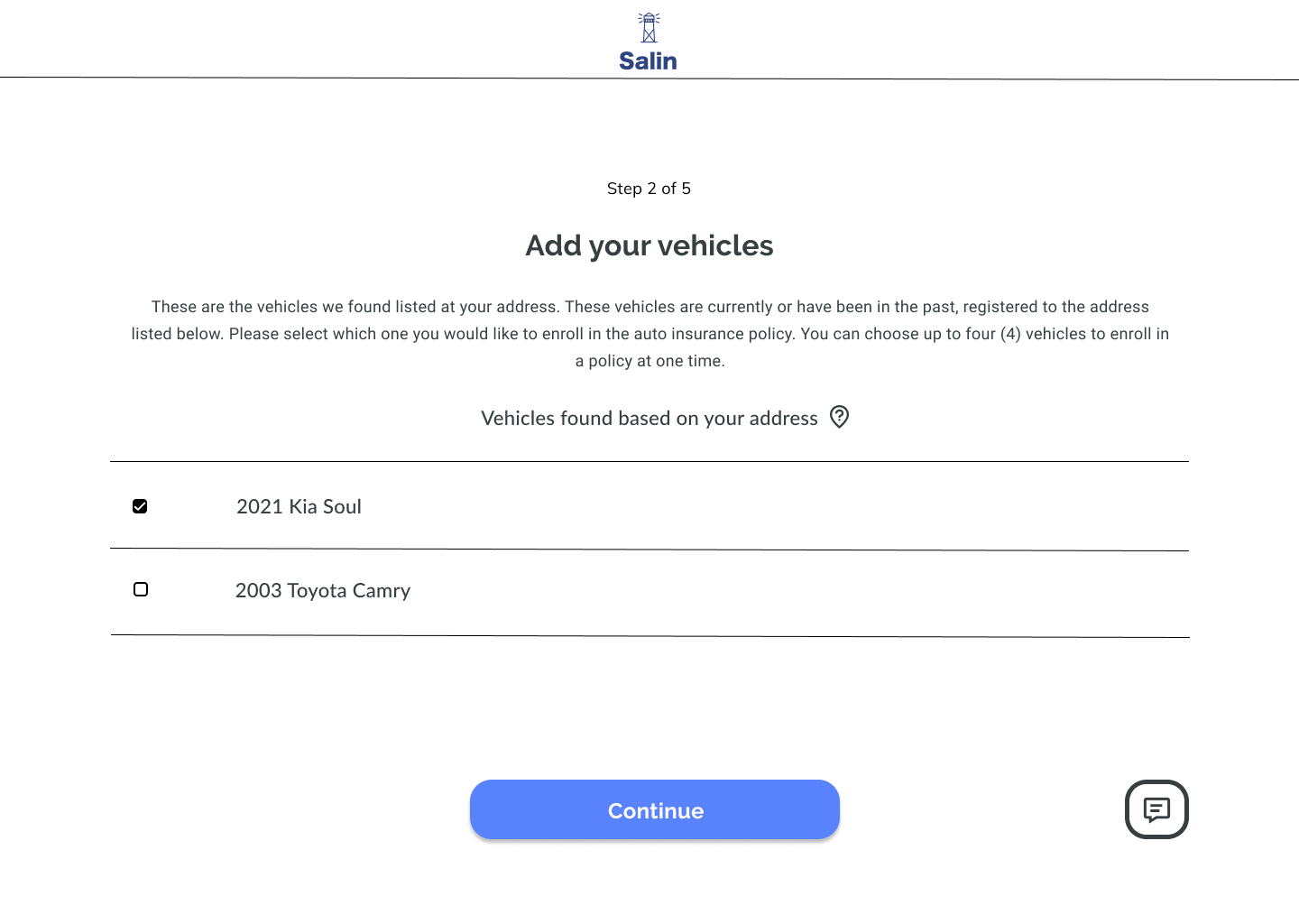
After finishing the hand drawn sketches, it was on to the next step. Some mid-fidelity wireframes were made to figure out the basic layout of the site. The full set of wireframes can be viewed here.
Building a Brand Identity
Salin needed a refresh when it came to its brand identity. As mentioned in project overview, Salin has been in business for past 30+ years but has been losing business to competitors with better online presences. I knew the brand identity would require an overhaul. Users needed to land on the site and feel welcomed. There couldn’t be any of the usual associations people have with insurance such as confusion, complicated, and not dependable.
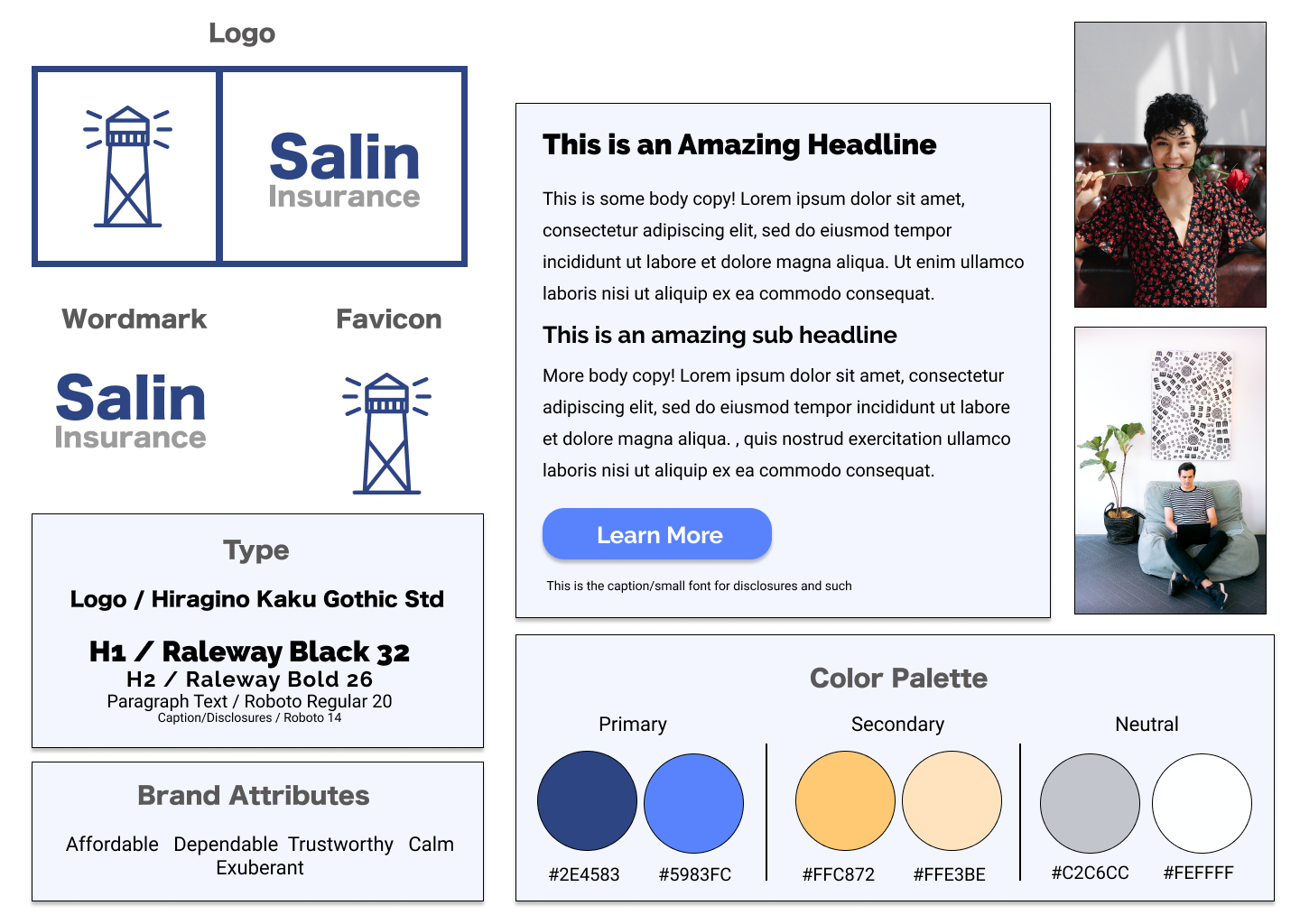
For ideation, I kept the focus on creating a brand identity that was welcoming and minimal. Several different logo concepts were made.
The brand attributes I kept in mind during designing the logo included: affordable, dependable, trustworthy, calm, and exuberant. Remembering these, the final logo involved a lighthouse, blue border, and ‘Salin’ in dark blue color.
A dark blue color in the logo set symbolizes trust and helps the user feel welcomed by the brand. The lighthouse is meant to symbolize how Salin is always looking out for them. The sans serif font Hiragino Kaku Gothic Std gives a minimal, modern feel to the brand.
UI Design: Style Tile
High-Fidelity Wireframes
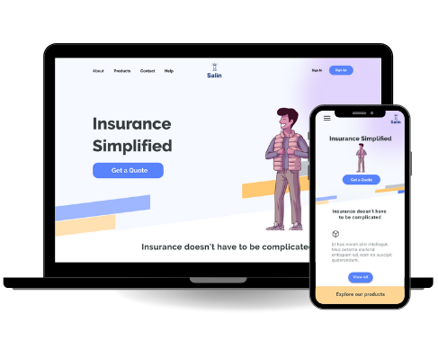
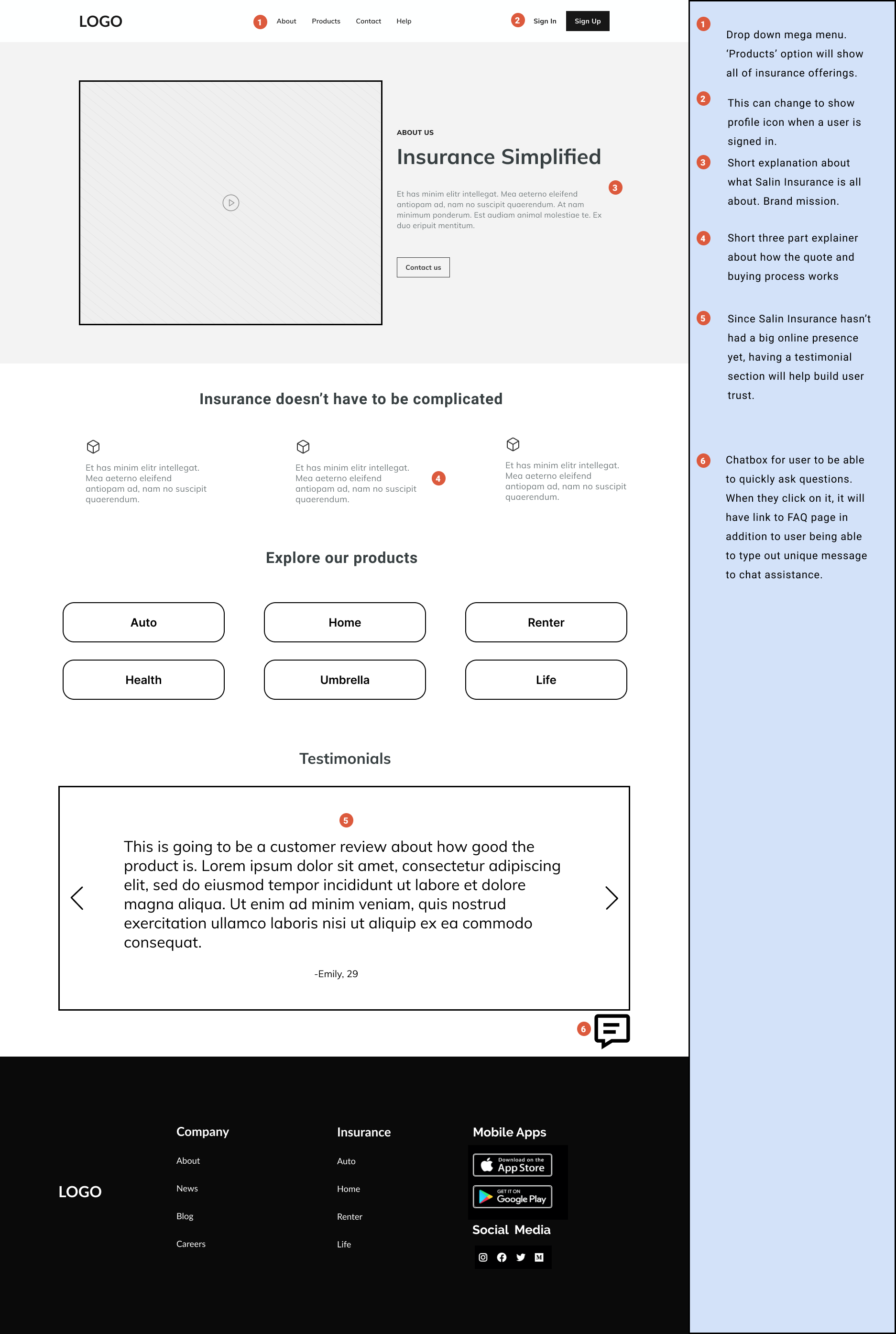
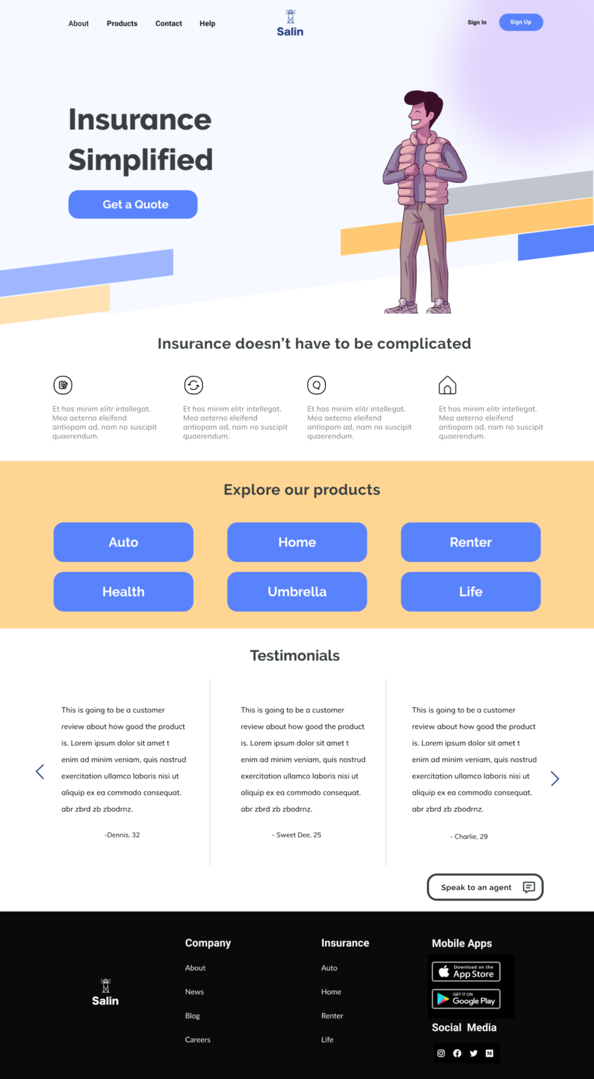
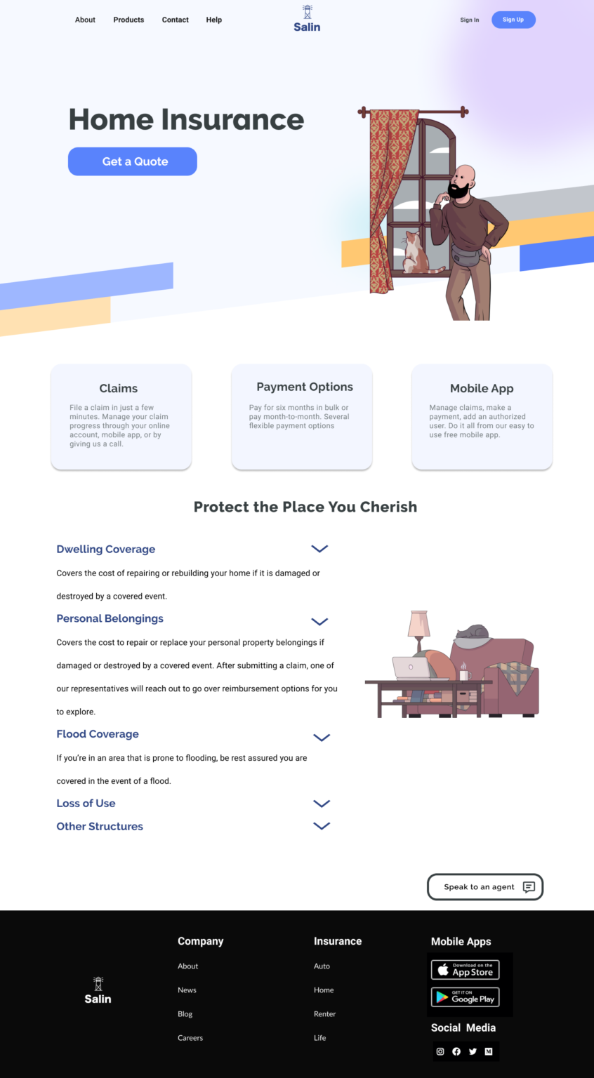
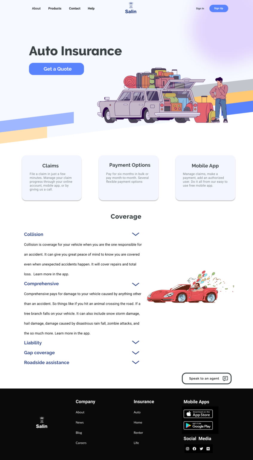
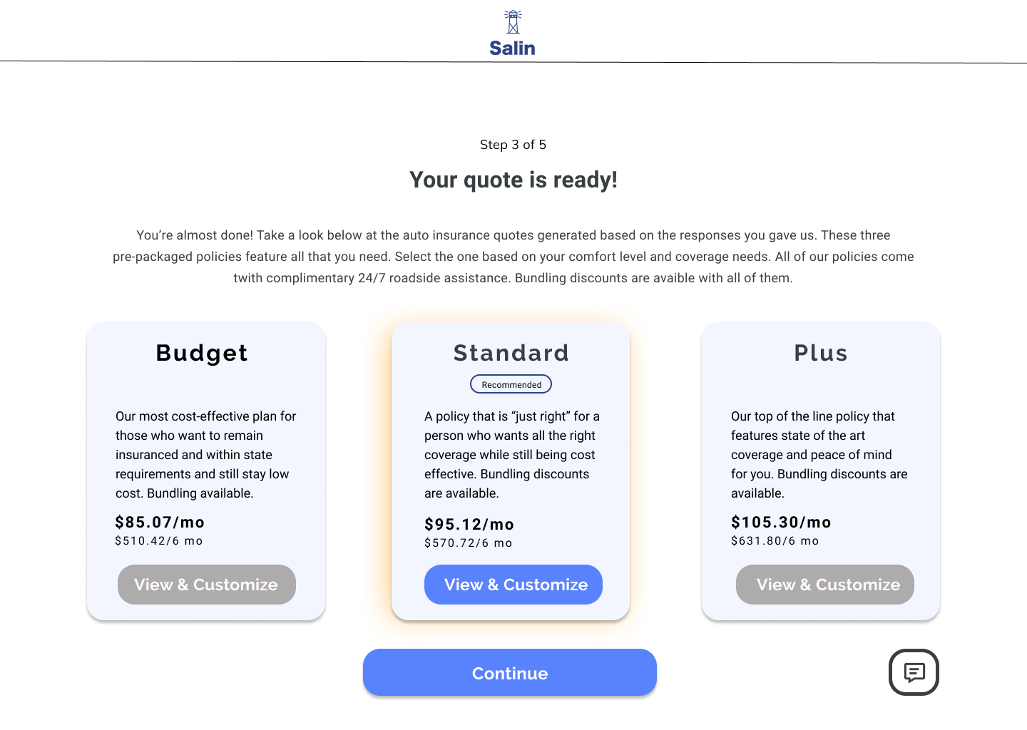
All of the branding came together and went into making the high fidelity wireframes. The result is a modern, inviting website with a color palette of blues and yellows that signify trust and optimism. There is a short four-column layout below the hero section that gives users a short explainer on the company. Testimonials fit right below the product buttons, allowing for a user to quickly get real customer insight for their design making.
The welcoming design still keeps Salin’s long standing reputation in mind, with a simple sans serif type set and minimal layout.
To view the high-fidelity screens in Figma, click here.
Previous
Next
Usability Testing
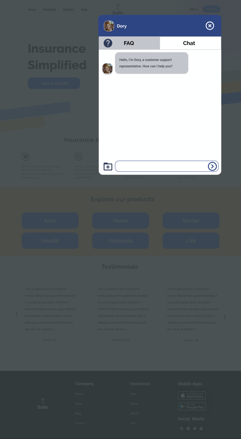
Using the prototype (created with Figma), I conducted a usability test involving five participants who completed the user flow task. User tests were done via a combination of in-person as well as video chat (using Zoom). Overall, the design worked well for all users. They were able to find navigation quickly, click each target with ease, and feel comfortable with the design. Several compliments were given on the color scheme. How it felt “fun and nice to see”.
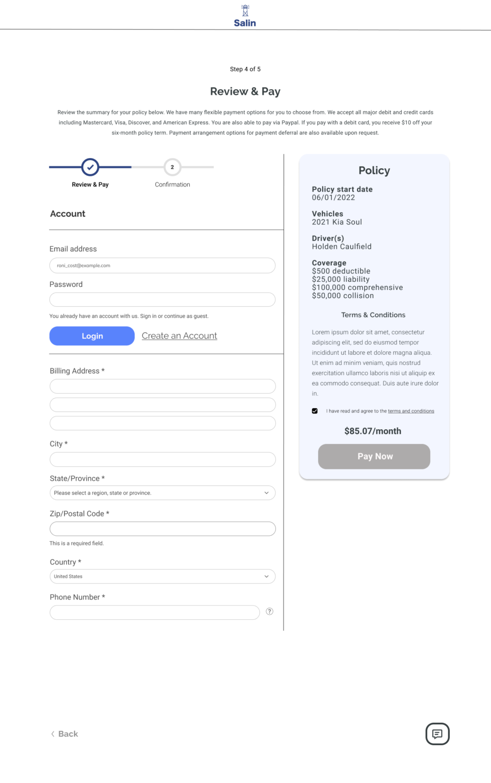
There were a few areas of improvement. One user said the quote process didn’t feel fully cohesive. When she first clicked on the “get a quote” button, the next screen that was shown felt as if she had been redirected to a 3rd party site. Another user had confusion on locating the “pay now” button on the final checkout page.
The user tests validated the brand goals of creating a welcoming design that is easy to use.
Final Thoughts
Creating an entirely new brand identity and user interface while still keeping a company’s long standing reputation in mind, was a challenge. Making sure the brand identity conveyed the brand attributes well was a big task. I realized the importance of iterating several times and getting feedback from other design peers.
The thing that helped make everything much more streamlined was having certain deliverables in place such as the user persona, project goals matrix, and site map. These acted as a sort of compass and kept me centered towards fixing the main objective: creating a website solution that is easy to use, minimal, and allows for a straightforward insurance buying experience.